
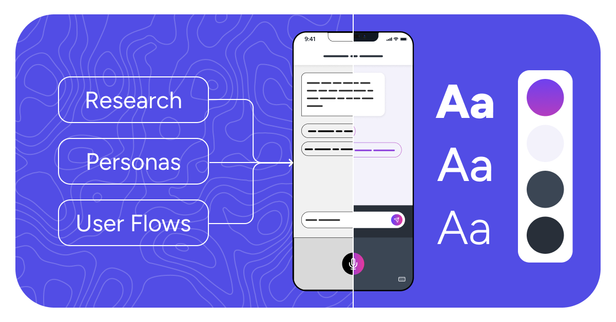
The Polished Screens Are the Smallest Part of the Story
When people see a finished interface, they’re seeing the result of dozens of conversations, questions, sketches, decisions, and iterations that happened long before the UI took shape. The polished screens matter, but they’re only one part of UX. Much of the real work happens earlier, when teams are still figuring out what they should build, who they’re building it for, and how the experience should actually work.
There’s something slightly misleading about looking at a finished product in a portfolio.
You see polished screens, thoughtful interactions, a clean design system, and everything sitting exactly where it belongs. It can make the design process look wonderfully straightforward, as though someone opened Figma, had a particularly productive afternoon, and emerged with the answer.
The reality is much messier, and honestly, much more interesting.
Before we get anywhere near polished UI, there are conversations with stakeholders, questions about users, workshop notes, rough sketches, journey maps, early wireframes, abandoned ideas, design critiques, and plenty of moments where the team realizes something they thought was simple is actually quite complicated. There are assumptions to challenge, priorities to clarify, and workflows to understand before anyone should be worrying about button colors.
That work isn’t always the part that makes it into a case study, but it’s often where some of the most important product decisions happen.
“The polished screens are the smallest part of the story.”
It Usually Starts With Questions, Not Screens
When we begin working on a product, our first instinct isn’t to open a design file. It’s to understand what we’re actually trying to solve. That means talking with the people closest to the product, understanding the business goals behind the project, learning what we already know about users, and identifying where we’re still making assumptions.
These early conversations can change the direction of an entire project. A feature that initially seems essential may turn out to solve a much smaller problem than expected. A workflow everyone assumed was straightforward may reveal several different user scenarios. Sometimes the team realizes that the original brief isn’t quite the problem they need to solve at all.
This is why discovery matters. It gives teams room to understand the problem before becoming attached to a particular solution. The goal isn’t to make the process longer. It’s to make sure the work that follows is pointed in the right direction.
Then We Make the Invisible Visible
One of the challenges with software is that everyone can be talking about the same product while imagining something slightly different. A stakeholder may be thinking about business requirements, a developer about technical dependencies, and a designer about the user’s journey. Everyone can agree in a meeting and still walk away with a different picture in their head.
This is where tools like journey maps, user flows, story maps, and workshop whiteboards become useful. They take ideas that have been living in conversations, meeting notes, and individual assumptions and turn them into something the whole team can see and discuss together. Once the experience is visible, gaps become easier to spot and decisions become easier to make.
The artifact itself isn’t necessarily the valuable part. A beautifully organized FigJam board isn’t the goal. The value comes from the conversations it creates and the shared understanding the team develops while building it.
Early Wireframes Are Supposed to Be Rough
There is a reason early wireframes aren’t particularly glamorous. At that stage, we’re not trying to make something beautiful. We’re trying to understand whether it works.
Keeping things simple allows us to focus on structure, hierarchy, workflows, and user decisions without becoming distracted by visual details. Can users find what they need? Does the sequence make sense? Are we asking for information at the right moment? What happens when something goes wrong? Are there steps we can remove entirely?
Rough wireframes also make it easier to change direction. Moving a grey box around is much less painful than redesigning a polished interface that took hours to create. That freedom encourages experimentation because the team hasn’t invested so heavily in one solution that changing it suddenly feels expensive.
Design Critiques Are Where Good Ideas Get Better
Another part of UX that rarely appears in the finished product is critique.
Designers review each other’s work, ask questions, challenge decisions, and look for things the person closest to the design may no longer notice. Developers may identify implementation considerations. Product managers may provide business context. Stakeholders may raise scenarios that weren’t part of the original discussion.
A good critique isn’t about proving that a design is wrong. It’s about making the thinking stronger. Sometimes a question confirms that the original approach makes sense. Other times it sends us back to explore something completely different. Both outcomes are useful because the goal isn’t to protect the first idea. It’s to arrive at the best solution the team can create with the information available.
That collaborative process is one of the reasons UX is difficult to represent through final screens alone. The finished interface may look simple precisely because a lot of complicated conversations happened before it.
Developers Are Part of the Process Before Handoff
One of the biggest misconceptions about UX is that designers finish their work and then hand it over to development. On strong product teams, collaboration starts much earlier.
Bringing developers into conversations while flows and features are still taking shape helps uncover technical constraints, dependencies, edge cases, and opportunities before they become expensive problems. It also gives developers context around why decisions are being made rather than asking them to interpret intent from a finished screen later.
That collaboration works both ways. Development considerations can influence design, just as user needs influence technical decisions. When both disciplines are involved early, the eventual handoff becomes much less of a handoff at all. It becomes a continuation of a conversation the team has already been having.
And Then, Eventually, the UI
By the time we begin refining the visual interface, a surprising amount of the design has already happened. We understand the user journey more clearly, the major workflows have been explored, priorities have been discussed, and many of the difficult questions have already surfaced.
That foundation gives visual design a purpose. Decisions about hierarchy, components, interactions, and content aren’t being made in isolation. They’re connected to everything the team learned during discovery and exploration.
Of course, visual design still involves iteration. Interfaces are reviewed, prototypes are tested, details are refined, and new questions continue to appear. UX is rarely a perfectly linear process. But the polished screens now have something much more important behind them: context.
What This Looks Like at Pepperplane
A lot of our work at Pepperplane happens in the spaces clients and end users may never see. It’s in the workshop where a stakeholder suddenly realizes two teams have been defining the same workflow differently. It’s in the FigJam board covered in notes after a discovery session. It’s in the rough wireframe that gets thrown away because it helped us uncover a better idea. It’s in the conversation between a designer and developer that resolves an edge case before implementation begins.
Those moments aren’t as polished as the final interface, but they’re often the moments that make the final interface possible. We work closely with clients and developers throughout the process because UX isn’t something we believe should happen behind a curtain and appear at the end as a finished design.
The process is collaborative by nature. The more shared understanding we can create along the way, the more confidence everyone has when it’s time to build.
Final Thought
When you look at a polished interface, you’re looking at the end of a much longer story. Behind it are questions that changed the direction of the project, conversations that aligned stakeholders, rough ideas that didn’t survive, insights that uncovered something unexpected, and countless small decisions that gradually shaped the experience.
That’s why we don’t think the value of UX can be measured by screens alone. The interface is important, but it’s the visible result of all the thinking, collaboration, research, and iteration that came before it.
The next time you see a product that feels wonderfully simple to use, there’s a good chance the process behind it wasn’t simple at all.
And that’s kind of the point.
Ready to Build Better Products Together?
Looking for a UX partner who can bring clarity to your next project? We’d love to chat.
Book a discovery call and let’s build something remarkable together.