

Why the Smallest Interface Decisions Aren’t Always the Simplest
Some UX decisions take hours of workshops and exploration. Others look like they should take five minutes, until you start asking what happens when a real person actually uses them. A label, button placement, default state, or seemingly minor interaction can affect everything from user understanding to accessibility and implementation. Sometimes the smallest decisions create the longest conversations, and there’s usually a good reason for it.
There’s a particular kind of UX decision that looks almost comically simple when you see the finished product. Maybe it’s a button. A confirmation message. Where an action should live. Whether something should happen automatically or require the user to make a choice.
The actual design might take five minutes. Deciding what it should do? That can take two hours.
From the outside, this can seem like an impressive amount of discussion for something so small. But once you start unpacking the decision, it usually turns out that the team isn’t debating a button at all. They’re debating what users expect, what could go wrong, what the business needs, how the system behaves, and what happens in all the scenarios surrounding that tiny interaction. Suddenly, five minutes in Figma has turned into a much bigger product conversation.
“It took five minutes to design and two hours to decide.”
The Decision Looked Simple
Every product seems to have at least one of these. On the surface, there are only a couple of reasonable options. Put the action here or there. Use this label or that one. Make this the default or let the user choose. Show a confirmation or let the action happen immediately. Visually, none of the options is particularly difficult to design but UX decisions don’t exist in isolation. The moment we start asking what each option means for the person using the product, the conversation gets more interesting.
Does the user understand what will happen before they click? Is the action reversible? How often will they need it? What happens if they make the wrong choice? Is there information they need before deciding? Does this interaction behave consistently with the rest of the product? The decision may occupy twenty pixels on the screen, but its consequences can reach much further.
Then There Were Multiple Reasonable Answers
The hardest UX decisions aren’t always the ones with an obviously bad option. They’re often the ones where several options could work.
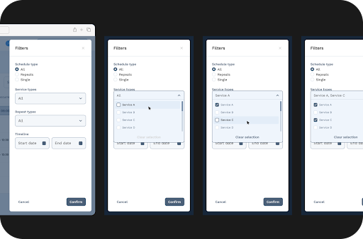
One approach may reduce the number of steps for users but make an important action easier to trigger accidentally. Another may provide more control but introduce unnecessary friction for something people do frequently. A third might be the clearest experience but require significantly more development effort because of how the existing system works. This is where design stops being about finding the prettiest answer. We’re weighing trade-offs.
There may not be one option that’s objectively perfect. Instead, the team has to understand what matters most in that particular context and make a decision that balances user needs, business requirements, and technical realities. That’s often why the conversation takes longer than the design itself.
User Behavior Changes the Question
A decision that seems obvious internally can feel very different once we consider how people actually use the product.
Perhaps experienced users want speed, while someone encountering the workflow for the first time needs more guidance. Maybe users repeatedly perform an action and an extra confirmation would quickly become irritating. On the other hand, if that same action has serious consequences, a little friction might be exactly what the experience needs.
Context changes everything. Instead of asking, “Which option do we prefer?” we need to ask what users are trying to accomplish and what they need at that particular moment.
Sometimes research gives us a clear answer. Sometimes previous behavior, analytics, support feedback, or usability testing provides useful evidence. Other times, we have to make the best decision we can with the information available and remain open to learning after implementation. The important thing is that the choice isn’t being made simply because one version looks cleaner in Figma.
And Then Development Joins the Conversation
What appears to be a tiny interface decision can also have surprisingly large technical implications. Maybe one option requires the system to remember a user’s previous choice. Perhaps an interaction depends on data that isn’t always available immediately. A seemingly simple undo action might require additional logic behind the scenes, while changing a default could affect existing users in ways the design alone doesn’t reveal.
This is one of the reasons we like involving developers in product conversations rather than waiting until everything is “finished.” They bring another layer of context.
Sometimes a technical constraint eliminates an option. Other times, a developer suggests an approach that gives us the same user benefit with considerably less complexity. And occasionally, what everyone assumed would be easy turns out to be anything but. That’s product development for you.
Why We Spend Time Debating Something So Small
Two hours discussing one interaction can sound excessive until you compare it with the cost of getting that interaction wrong thousands of times. Tiny decisions repeat.
A confusing label may appear every time someone completes an important task. An unnecessary confirmation could interrupt users dozens of times a day. A poorly chosen default may quietly influence thousands of decisions. A small inconsistency can become increasingly noticeable as a product grows. That doesn’t mean every button deserves a two-hour meeting. We’d never ship anything. It means the amount of attention a decision deserves isn’t necessarily proportional to how much space it occupies on the screen. Sometimes a very small interface element sits at an important moment in the user journey, and getting that moment right is worth a longer conversation.
“Two hours discussing one interaction can sound excessive until you compare it with the cost of getting that interaction wrong thousands of times. Tiny decisions repeat.”
Eventually, Someone Has to Decide
Good UX isn’t about discussing every possibility forever. At some point, the team has to make a choice.
Ideally, that choice can be connected back to something more meaningful than personal preference. We consider what we know about users, the importance and frequency of the action, business requirements, consistency with the rest of the product, technical constraints, and the potential consequences of getting the decision wrong. Then we choose the option that makes the most sense with the information we have.
Sometimes that decision feels obvious by the end of the conversation. Sometimes two reasonable options remain and we simply have to make a thoughtful call. That’s okay too.
UX isn’t about achieving mathematical certainty. It’s about making informed decisions and being able to explain the reasoning behind them.
What This Looks Like at Pepperplane
At Pepperplane, these conversations happen more often than you might expect.
A designer raises a seemingly small question. Another designer sees a different implication. Someone brings in what we learned from users. A developer adds technical context. The client or product team may have a business consideration that changes how we’re thinking about the decision and suddenly, we’re having a fairly substantial conversation about something a user may interact with for three seconds.
We don’t believe every tiny decision needs to become a committee meeting. But when something affects an important part of the experience, we want to understand the consequences before choosing a direction. The goal isn’t to make UX complicated. It’s to make the product feel uncomplicated to the person using it.
Final Thought
Some of the longest UX conversations produce the smallest visible changes. The user will never know how many options were considered. They won’t see the Figma comments, hear the debate, or know that a developer raised the question that eventually changed the direction.
They’ll just click the button and ideally, they won’t have to think very hard about it.That’s the funny thing about thoughtful UX. Sometimes the team spends two hours thinking about a decision precisely so the user doesn’t have to spend two seconds thinking about it later.The final solution might look incredibly simple. Getting there often isn’t.
Ready to Build Better Products Together?
Looking for a UX partner who can bring clarity to your next project? We’d love to chat.
Book a discovery call and let’s build something remarkable together.