Pencil Bible
A beautifully simple Bible app for taking notes
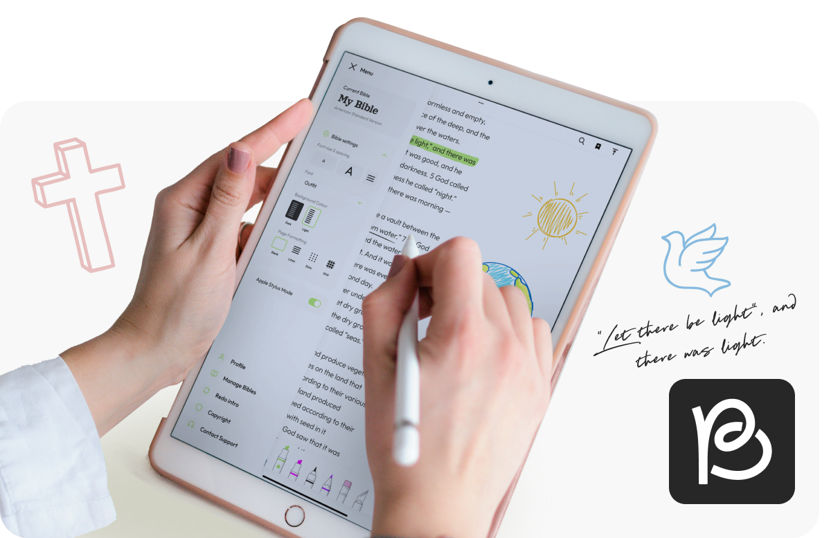
Pencil Bible bridges the gap between digital convenience and the intimacy of a physical journal. As a premier iPad app, it stands out by offering a truly “blank canvas” experience, allowing users to write, highlight, and doodle directly alongside scripture using the Apple Pencil. This unique approach transforms passive reading into an active, creative experience.
Project Scope:
UX Design
UI Design
Illustration
The Brief
Pencil Bible required a visual and functional evolution to fully support its growing community.
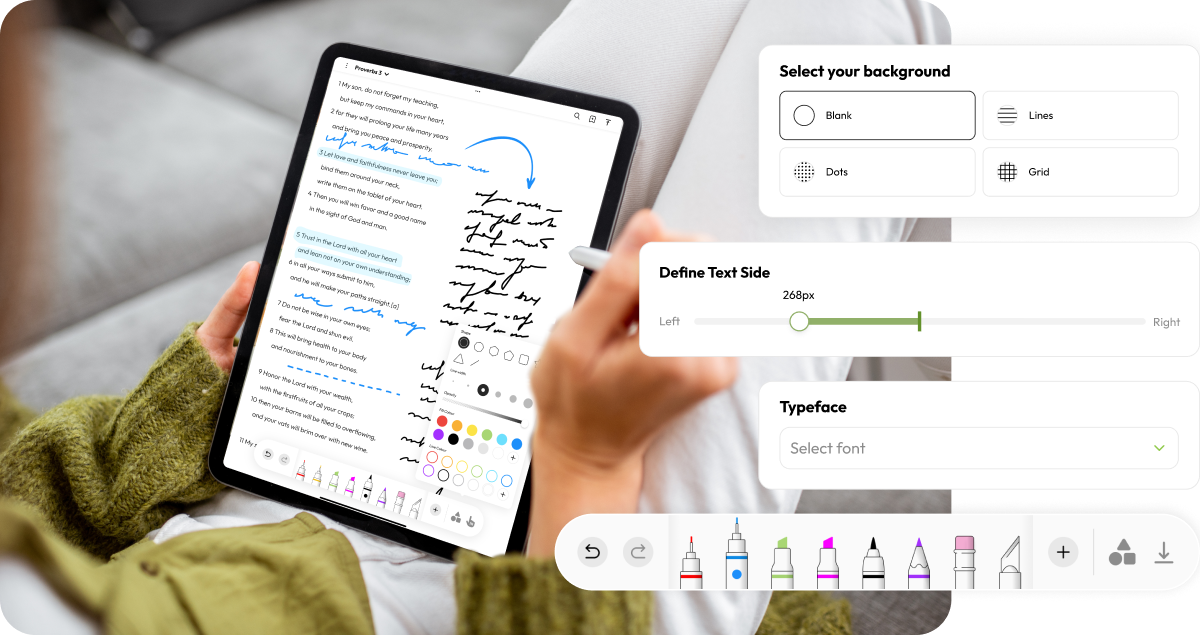
In addition to a UI refresh, we introduced a suite of custom illustrations designed to capture the warm, personal feeling of doodling in the margins without sacrificing the app’s credibility. By balancing this handmade aesthetic with a clean and professional interface, we created a digital environment that feels as authentic and personal as a well-worn paper notebook.
Our Process
UX Design
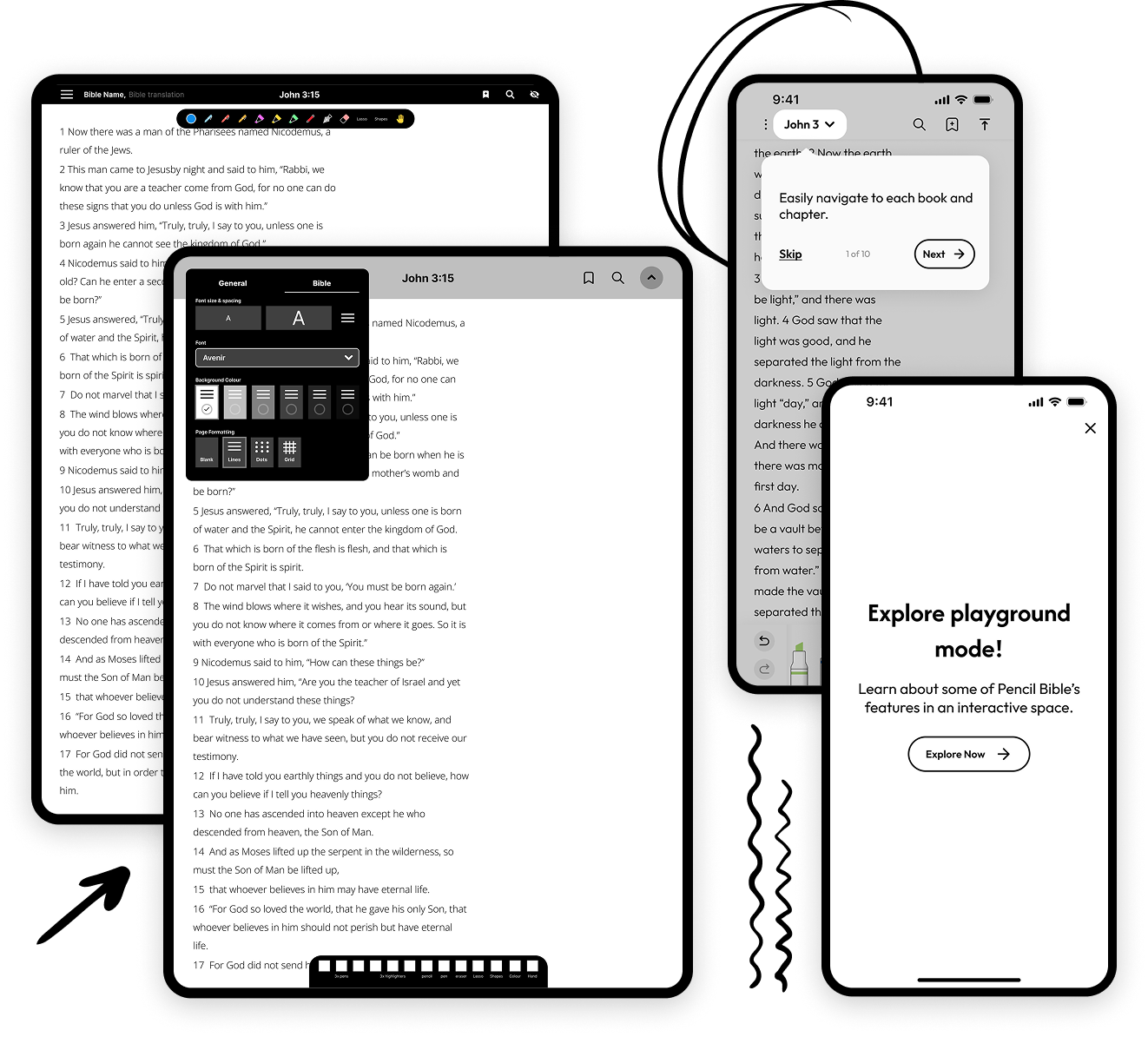
Working with the Pencil Bible team, we began by mapping out a strategy to enhance the app’s core utility. Our initial focus was on the foundational of the user experience: reading and navigation. We streamlined the flows for adding and configuring Bible translations and preferred reading settings. To improve findability, we overhauled how Books, Chapters, and Verses and navigated, making specific content easier to locate.
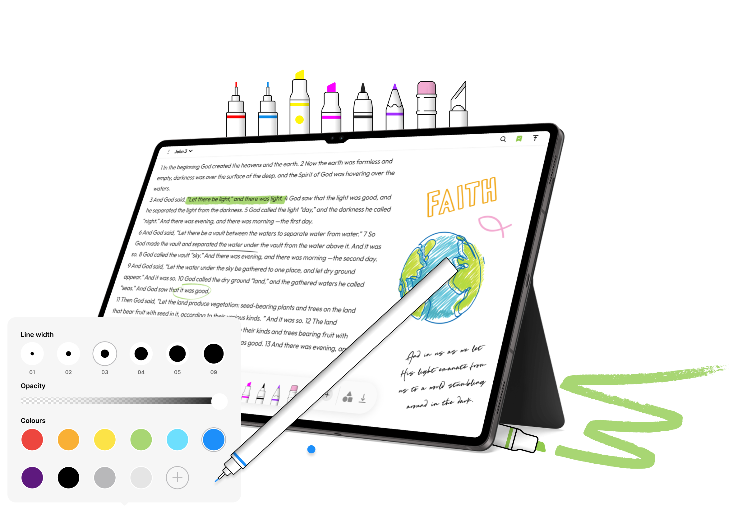
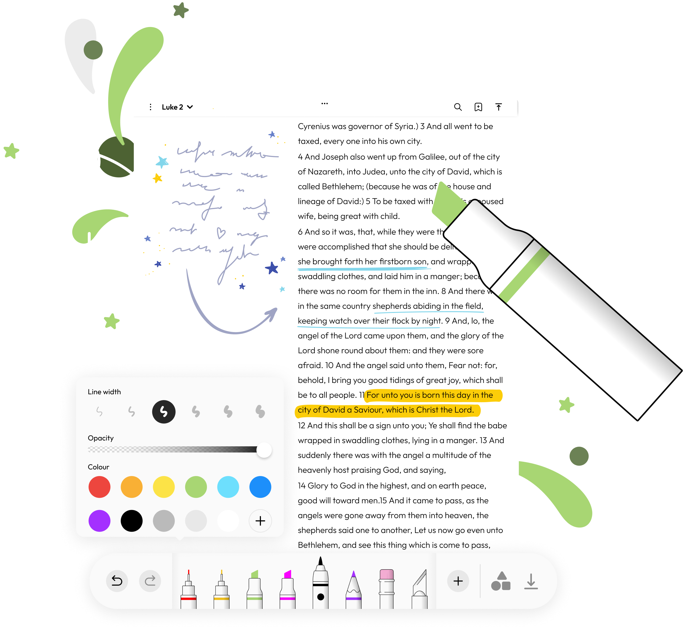
Since the app’s unique value lies in personal expression, we significantly expanded the journaling toolkit. We designed interfaces for new pen types, markers, shapes, and custom colour pickers, giving users more creative freedom. A key challenge here was accessibility; we focused heavily on interaction design to ensure these detailed tools were easy to manipulate in a touch-first environment.
Finally, we addressed how users begin their journey. We introduced a “Playground” onboarding experience, a sandbox environment that allows users to try out the full suite of annotation tools without impacting their existing Bibles.
UI design
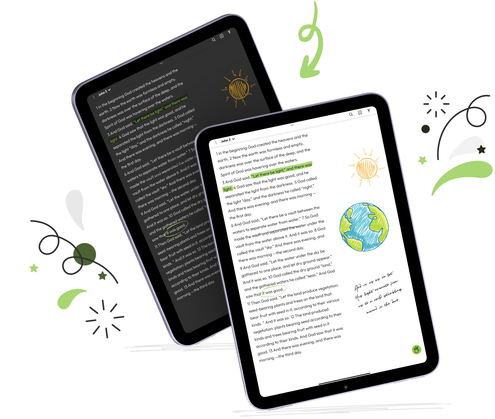
To ensure the interface feels spacious and inviting, we utilised a bright apple green as the primary colour for interactive elements and accents. Set against a clean white background with generous negative space, this high-contrast approach creates a crisp, modern aesthetic that guides the eye without overwhelming it. This visual language was applied across both iPad and iPhone layouts and included light and dark modes, ensuring the reading experience remains comfortable in any environment.
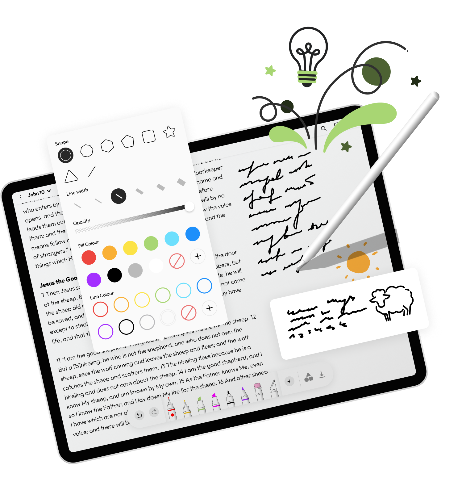
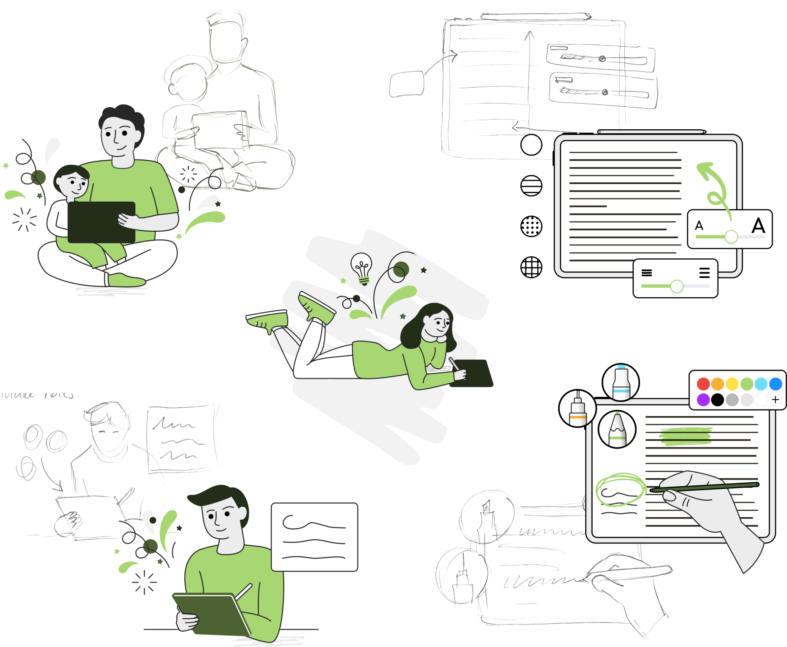
We extended the app’s visual identity by experimenting with various tool icons to find a style that is harmonious with the rest of the illustration collection.
Illustration
Custom illustrations in a hand drawn style helps the UI to become an extension of the creative canvas, maintaining visual consistency with the user’s own notes and doodles.
Typography
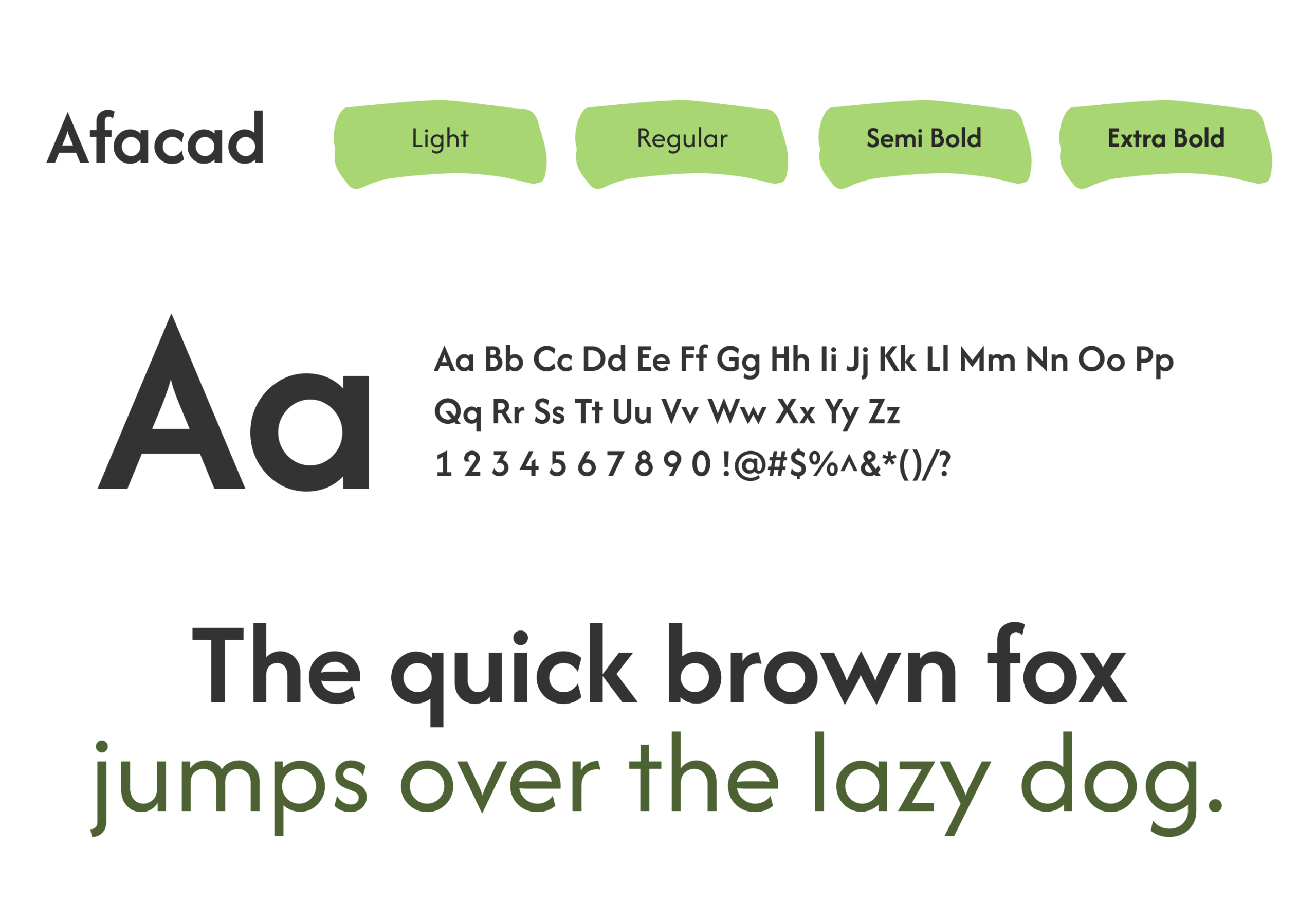
For the interface, we selected Afacad for headings and Outfit for body copy to ensure the app remains clean, modern, and accessible. This sans-serif pairing offers a crisp, elegant aesthetic that ensures high legibility across the UI, from navigation menus to tooltips. While we provide a polished structure for the app itself, users retain the freedom to customise the actual Bible text with their preferred typeface, ensuring the reading experience stays truly personal.
Colours
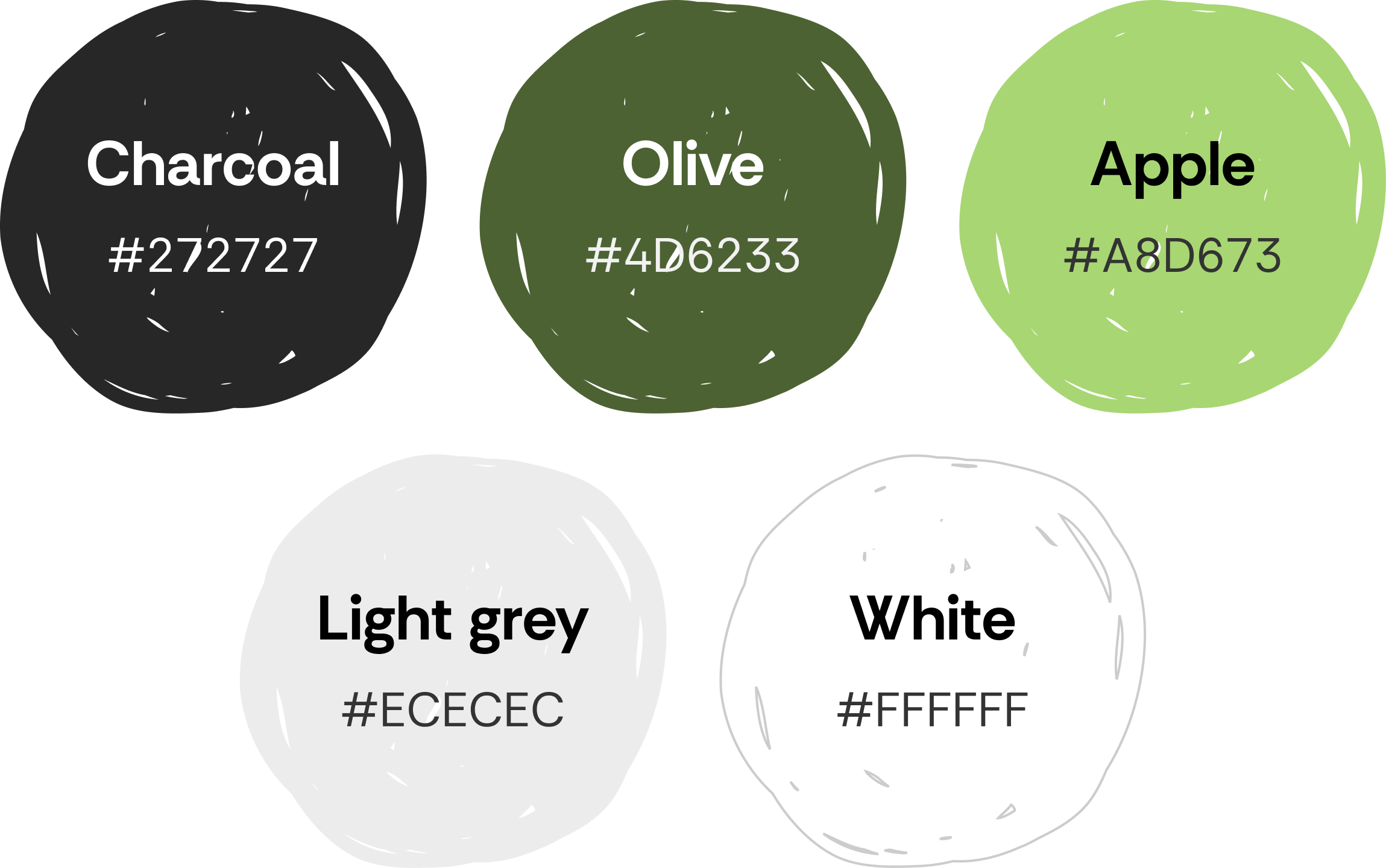
To create an environment conducive to reflection and focus, we curated a palette rooted in the organic warmth of nature. By blending the grounding depth of Charcoal and Olive with the fresh, vibrant energy of Apple green, the interface feels both sophisticated and approachable. This balance of earthy tones and clean neutrals establishes a calming, friendly atmosphere that invites users to engage with their creative journey without distraction.


Pepperplane was thorough in every part of the Pencil Bible design process—from the first wireframes to the logo and full brand system. They brought strong judgment and clear insight at each step, which helped turn the product into a real success. P.S. They are a patient and kind
Light & Dark Mode
The Conclusion
Ultimately, the redesign of Pencil Bible transforms a simple utility into a digital sanctuary. By harmonising a calm, organic aesthetic with a distraction-free layout, we created an inviting , distraction-free space for reflection, that allows the wisdom of the text to take centre stage.
This shift encourages users to move beyond passive consumption into active, creative reflection. It facilitates a truly transformative experience of personal connection and insight.
Together, these digital touchpoints gave Firenze the tools to scale their mission and deliver a premium experience that stands out in a competitive market.
Tools Used
Figma and ClickUp are great for UX projects because they offer seamless collaboration, efficient project management, and a comprehensive suite of design and organisational features.

Figma
UX / UI Design

clickup
Project Management & Tracking

Google Suite
Interviews & Note Capturing