Composer is a music therapy app designed to support research on how different types of music affects individuals living with dementia. With accessibility at its core, it offered the study participants a simple, intuitive way to connect with music, while giving researchers the insights they needed to study music’s deeper impact.
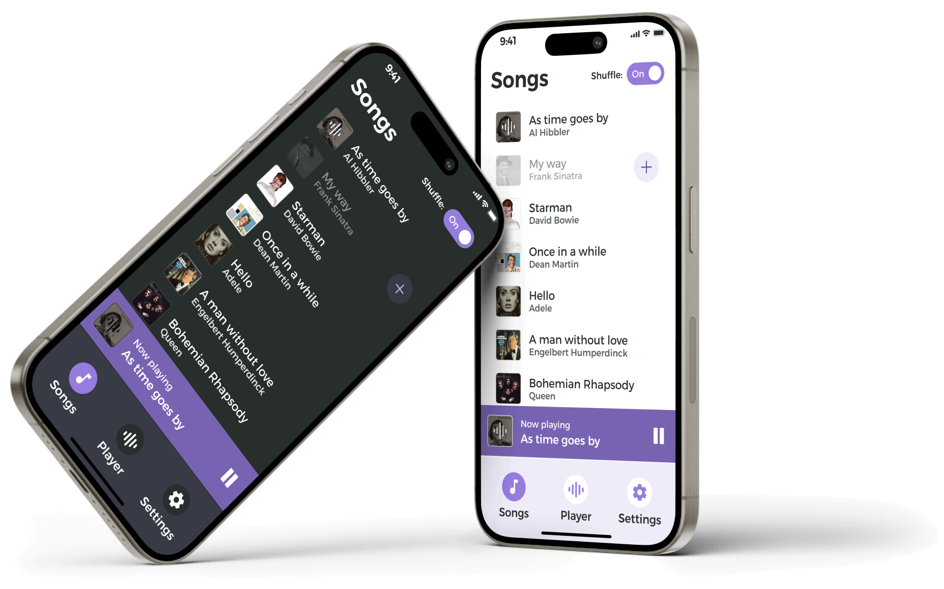
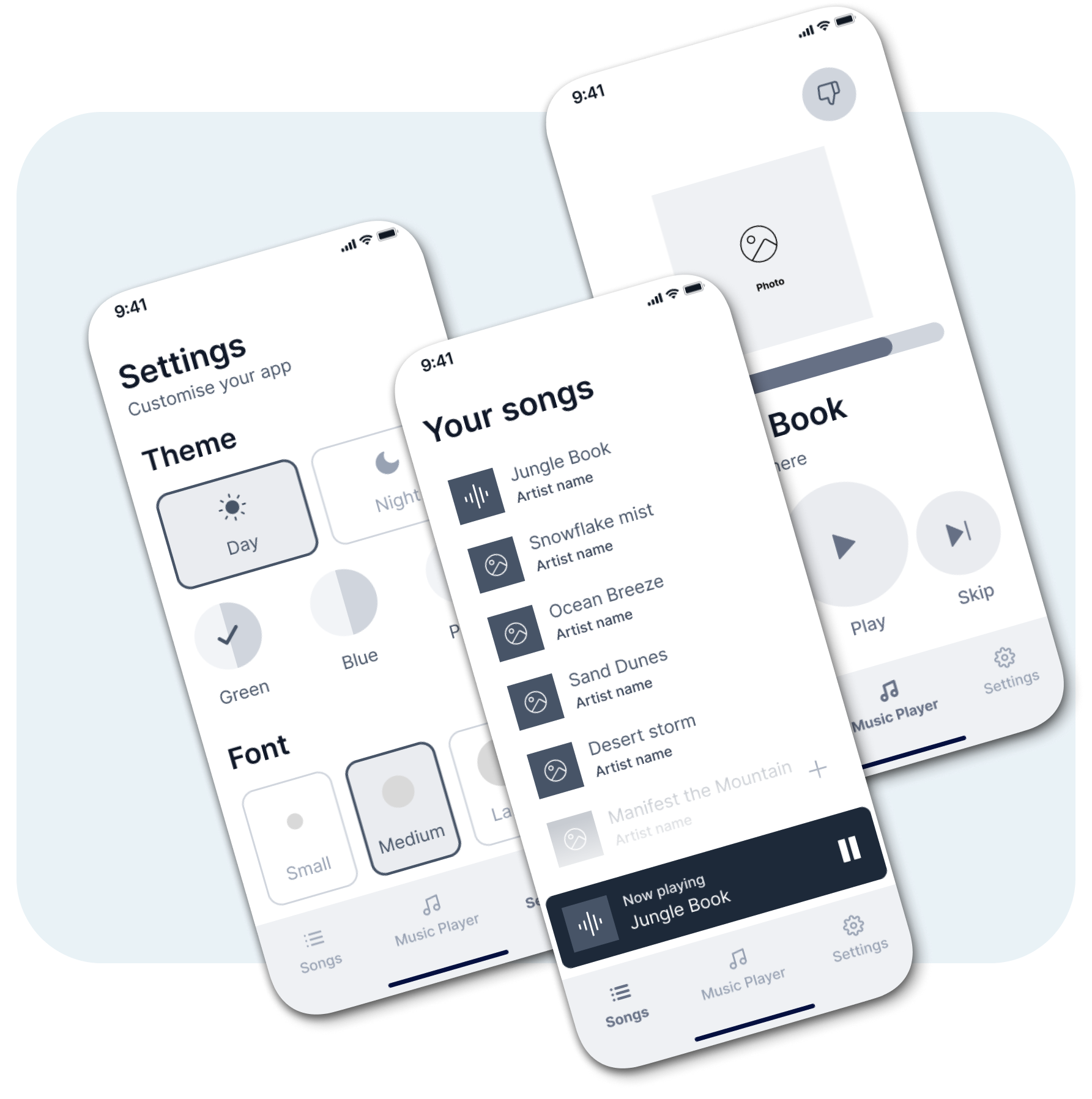
The brief was to make technology feel effortless for participants that might be unfamiliar with digital tools. We prioritized clarity, simple navigation, and included light/dark modes for comfort. Three colour themes and text sizes offered variety and personalization, allowing patients to focus on the therapeutic experience of music while giving researchers a clear way to study its effects.
We began by defining the core goals of the product:
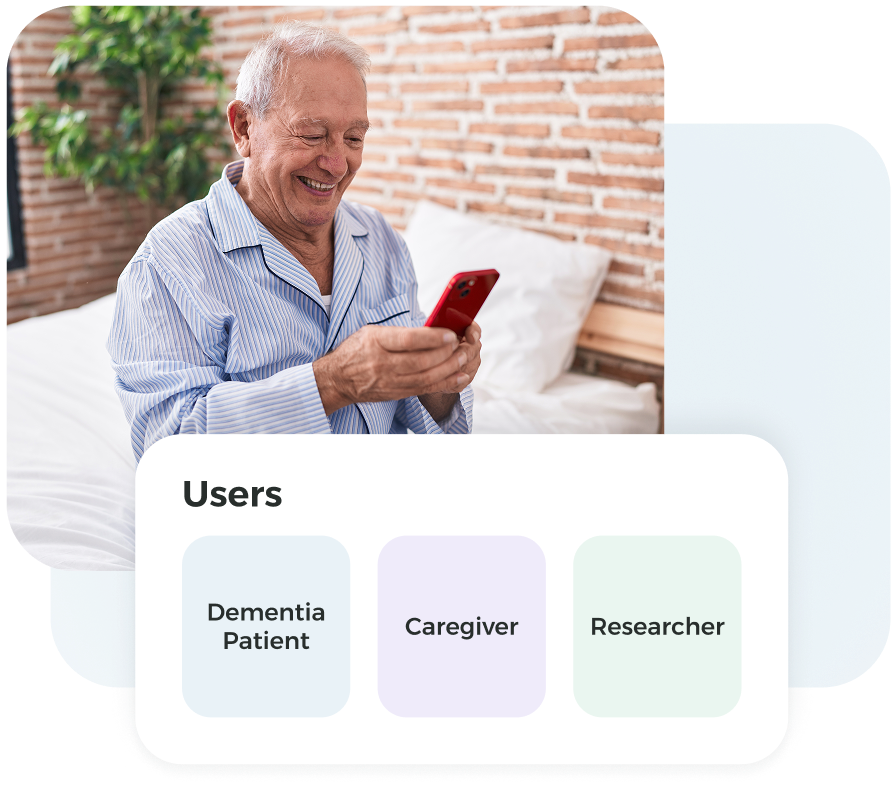
Users were identified as:
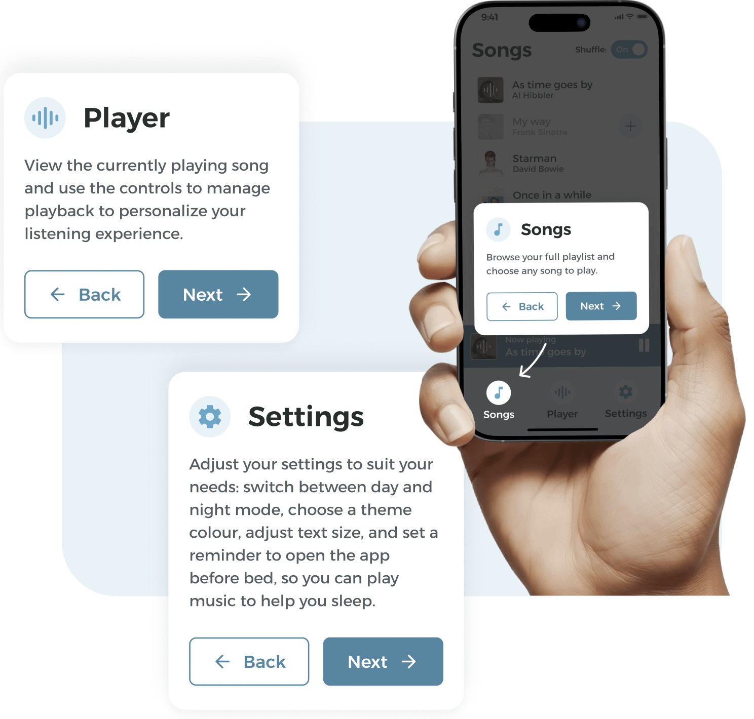
Guided by our research, we focused on accessibility and comfort, using calming colours, high-contrast elements, and simple layouts to make the app intuitive and welcoming for elderly users. We also added a step-by-step tutorial to help first-time users feel confident and supported when navigating the app.
We mapped out the app’s screens with simple layouts to test flow and usability, ensuring navigation was intuitive and content easy to find before adding visual design.
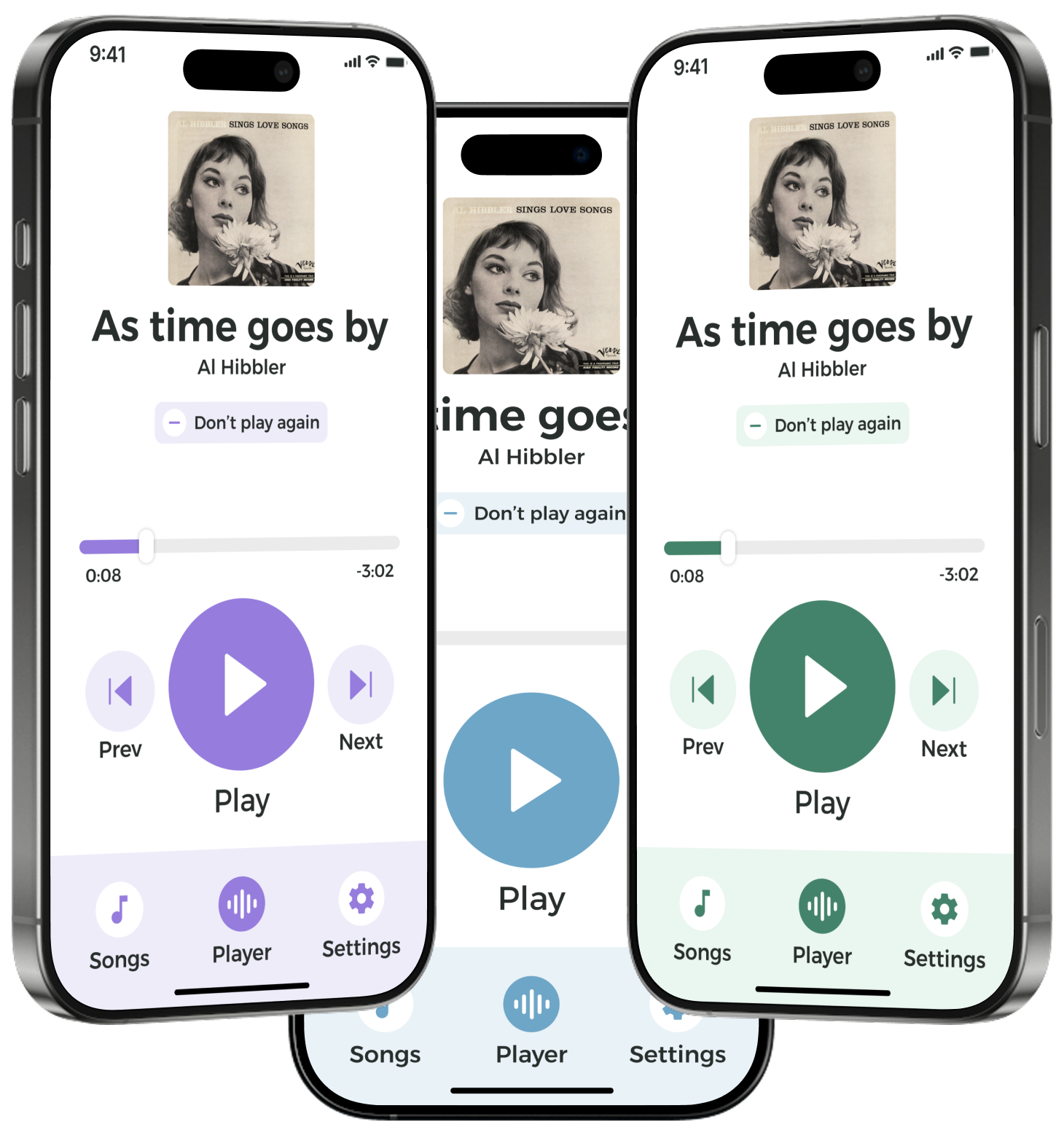
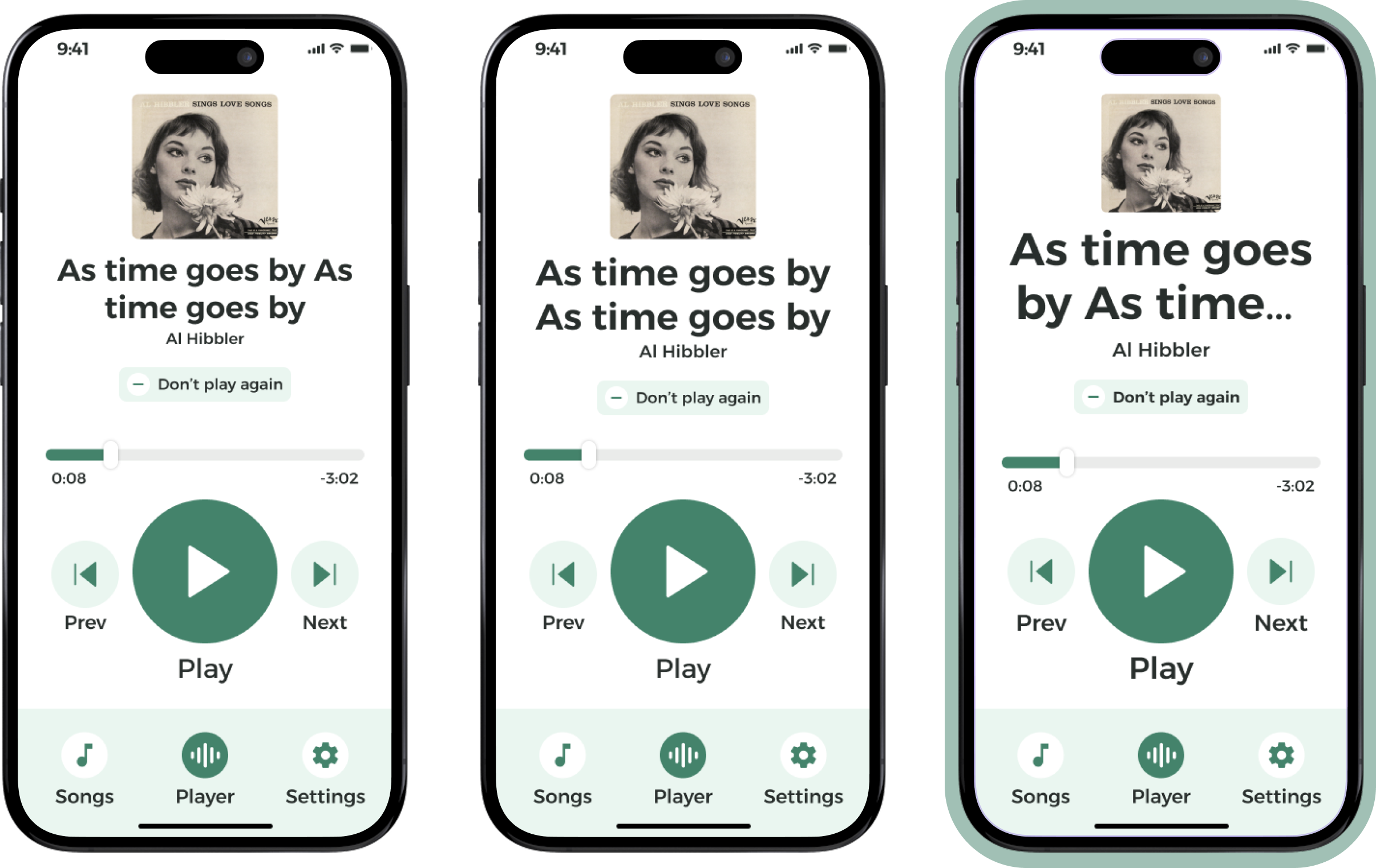
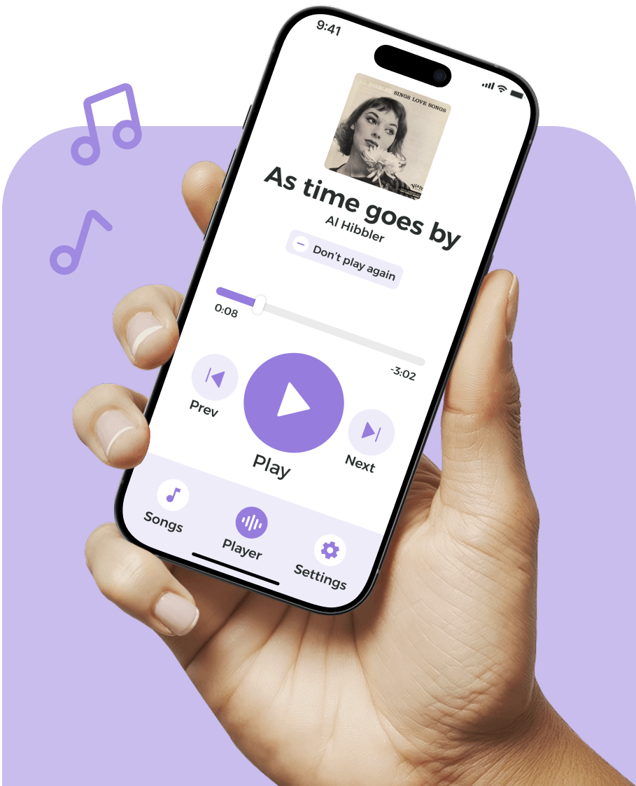
In the UI phase, we brought the app to life with thoughtful, flexible design choices. We set up three colour themes, three font sizes, and dark/light modes, all built as reusable Figma variables. This gave participants comfort and choice while keeping the design consistent, adaptable, and easy to maintain.
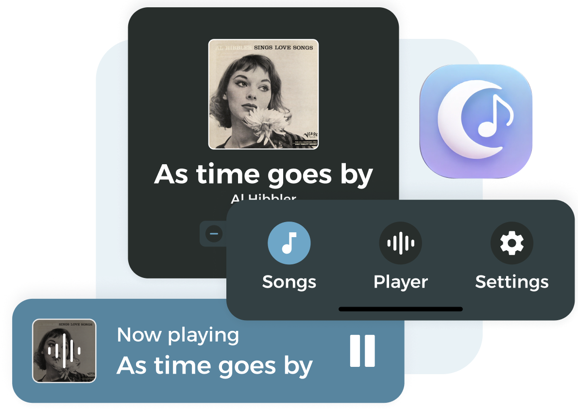
The primary typeface for Composer is Alexandria.


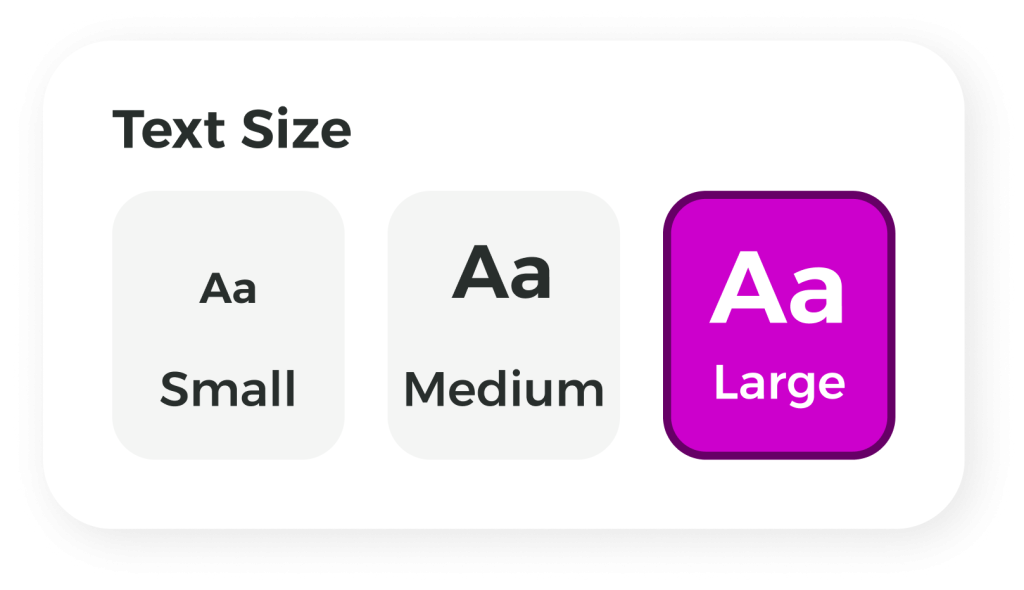
We designed three text sizes, set larger than typical apps, to make reading feel easier and more comfortable. This gave participants confidence when using the app, while giving caregivers and researchers the flexibility to choose what suited them best.
Composer’s colours needed to be accessible and calming. Research showed that muted pastels, mainly blues and greens, reduced anxiety, with purple adding a soft, feminine option. Each colour theme is applied monochromatically and balanced with grey and white, creating a calm, minimalist, and reassuring experience.


Composer was built with a singular purpose: to help researchers study how music influences individuals with dementia. By removing complexity, we created a tool that felt effortless for participants while providing researchers with the precision needed to gather meaningful data.
The result is more than an app – it is proof that thoughtful design can advance science and improve lives.
Figma and ClickUp are great for UX projects because they offer seamless collaboration, efficient project management, and a comprehensive suite of design and organisational features.
UX / UI Design
Project Management & Tracking
Interviews & Note Capturing

A design process that creates measurable, predictable and more profitable results.