and.flowers
Cultivating Occupational Justice through Design.
We crafted a bold, sensory-led identity for and.flowers, moving beyond floral clichés to root a therapeutic practice in sophisticated, earthy elegance.
Project Scope:
Brand Strategy
Visual Identity
The Brief
and.flowers isn’t a florist; it’s an Occupational Therapy practice and social enterprise. The challenge was to move away from “whimsical” or feminine floral stereotypes and build a professional, “catchy” brand that could bridge the gap between individual therapy and large-scale enterprise partnerships.
The Brief
and.flowers isn’t a florist; it’s an Occupational Therapy practice and social enterprise. The challenge was to move away from “whimsical” or feminine floral stereotypes and build a professional, “catchy” brand that could bridge the gap between individual therapy and large-scale enterprise partnerships.

The Work
Rooting a Brand in Purpose. We developed a visual language that reflects “Occupational Justice”—the idea that everyone has the right to engage in meaningful activities. By centering the brand on the harmony between nature and human connection, we positioned and.flowers as a grounded, vital community asset.

The Icon
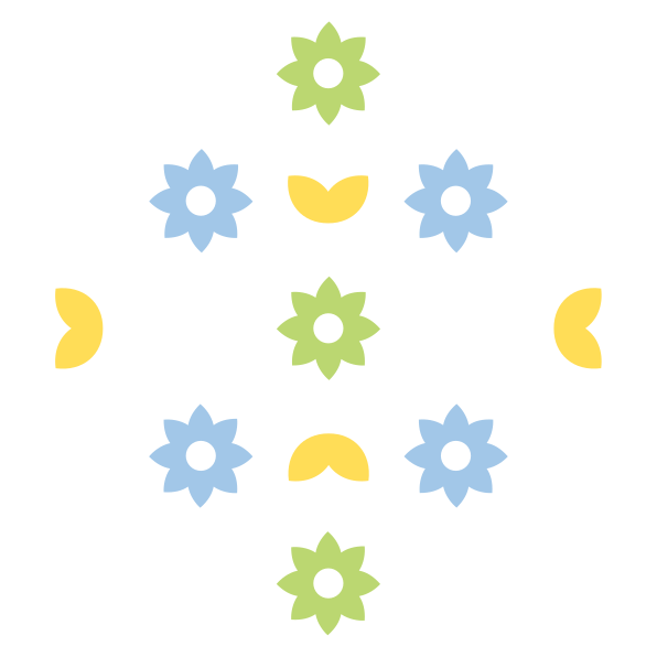
We created a simplified ampersand and flower icon. This mark acts as a bold, modern anchor for the brand, symbolizing the “and” in the name—the connection between the individual and their environment.
A Scalable Ecosystem
To support the enterprise arm, we built a modular logo system. Whether it’s London.and.flowers or a new partner, the typography remains harmonious, allowing the brand to expand without losing its core identity.

Organic Patterns
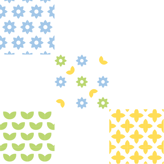
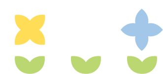
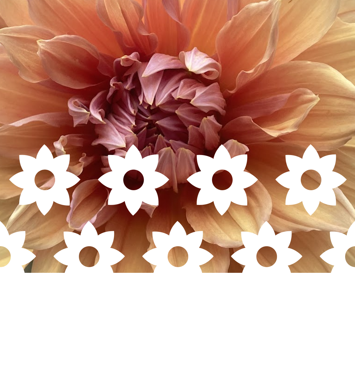
We designed a suite of seamless patterns and geometric shapes that add a tactile, sensory layer to the brand, providing versatility for packaging, digital assets, and social touchpoints.
because everything is
better with flowers
Font Family
We selected Outfit for its clean, friendly, and geometric proportions. It provides a professional “tech-adjacent” clarity that balances the organic nature of the brand.


The quick brown fox jumps over the lazy dog
Outfit
Bold
Colours
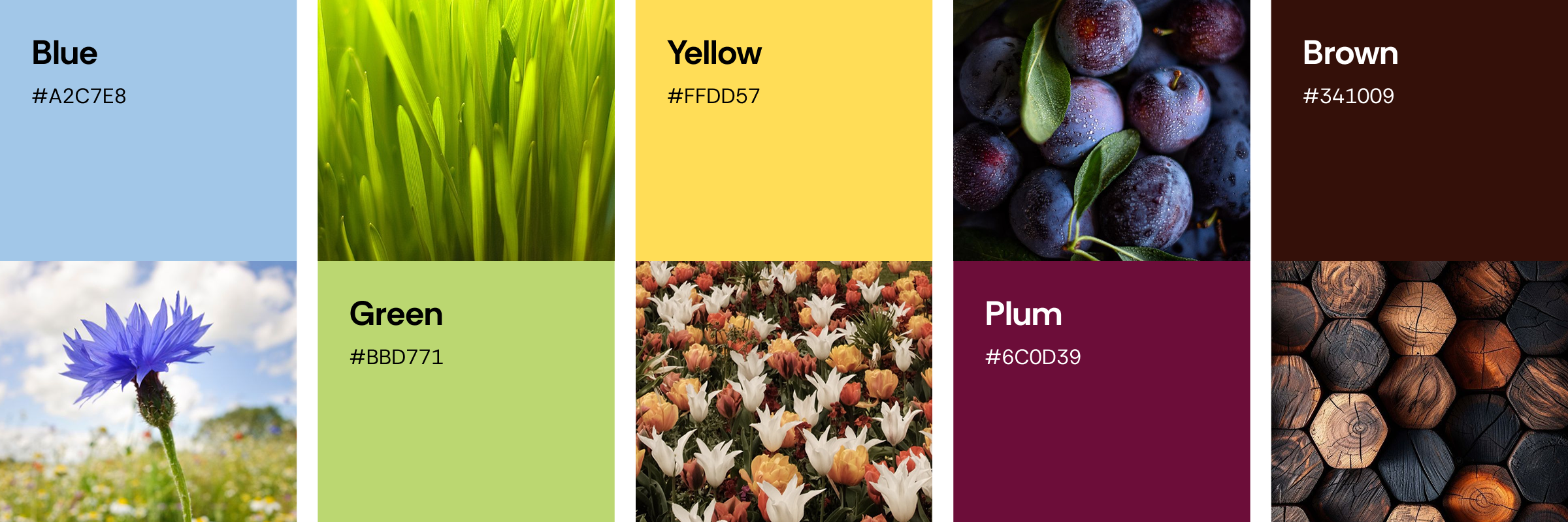
This vibrant palette blends electric blue and rich purple to convey innovation, trust, and engagement. Deep navy and twilight gradients add depth and focus, while the soft neutral ensures clarity. It reflects a modern, approachable, and friendly experience.
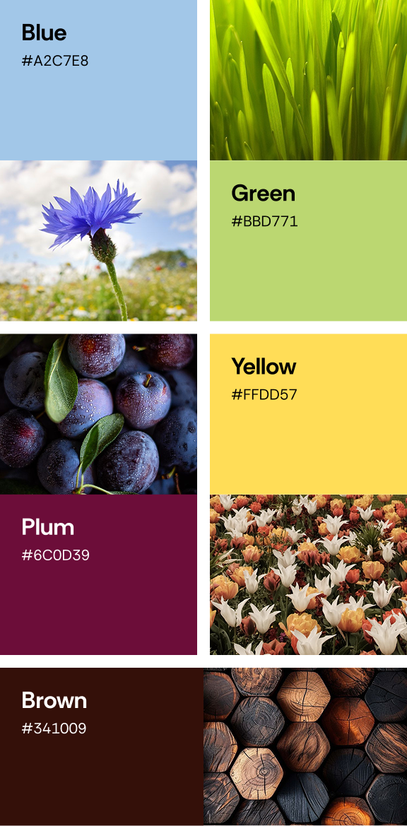
Colour Palette

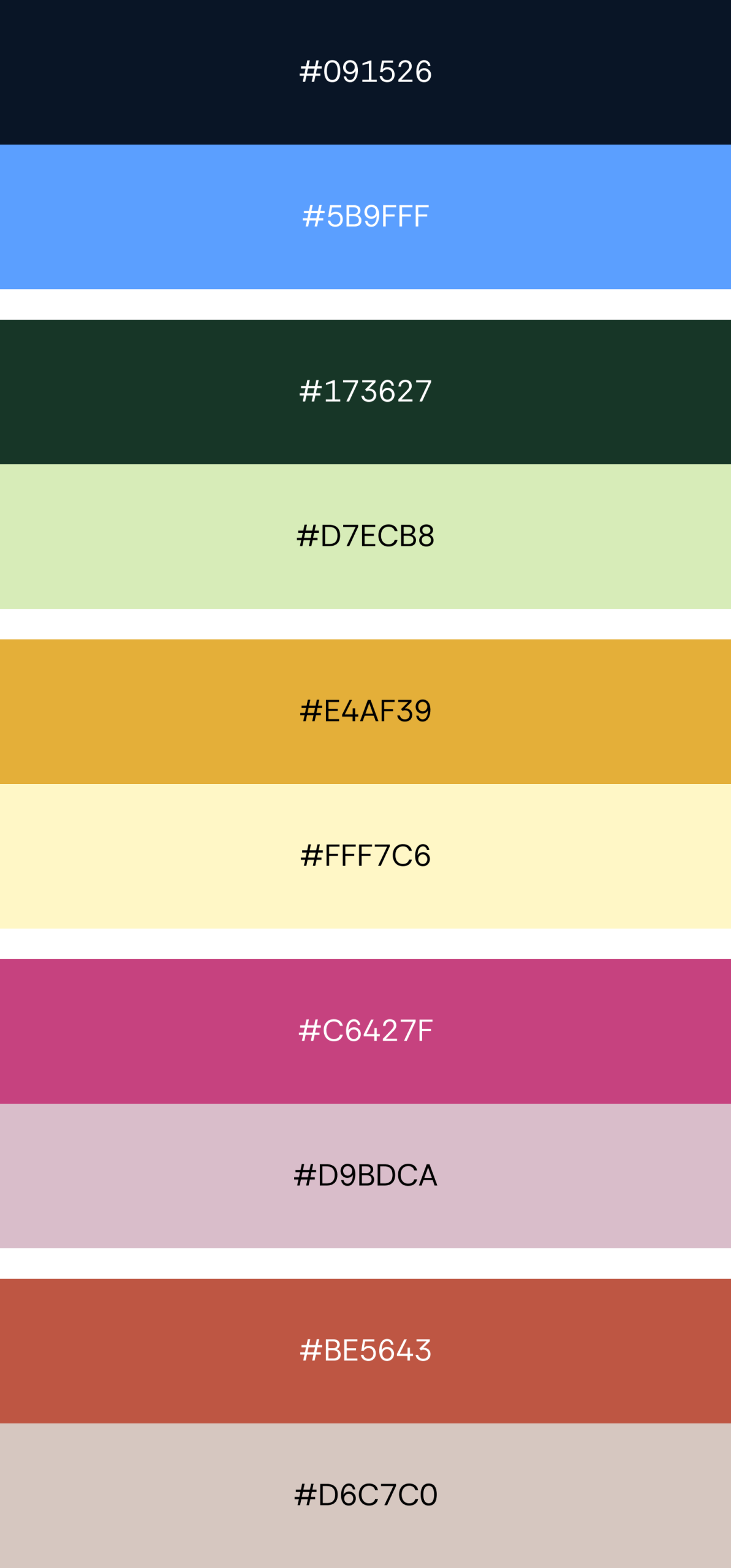
Colour Tones

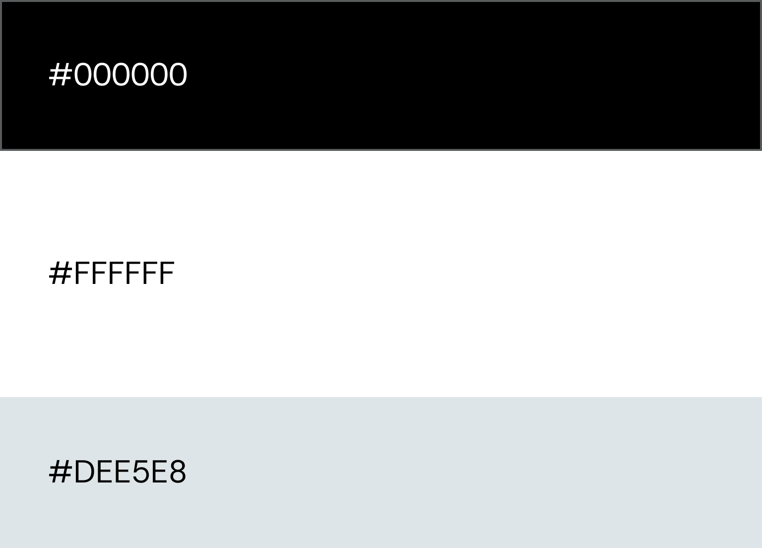
Neutrals

Client testimonial
to be added in here.
The Conclusion
and.flowers now possesses a cohesive, scalable identity that honours its occupational therapy roots while flourishing as a bold, recognizable social enterprise.
The result is a brand that feels as at home in a corporate boardroom as it does in a therapeutic garden.
Tools Used
Figma and ClickUp are great for UX projects because they offer seamless collaboration, efficient project management, and a comprehensive suite of design and organisational features.

Figma
UX / UI Design

Adobe Illustrator
Final Logo & Patterns

clickup
Project Management & Tracking