How our internal redesign reinforced why UX is more than just design.
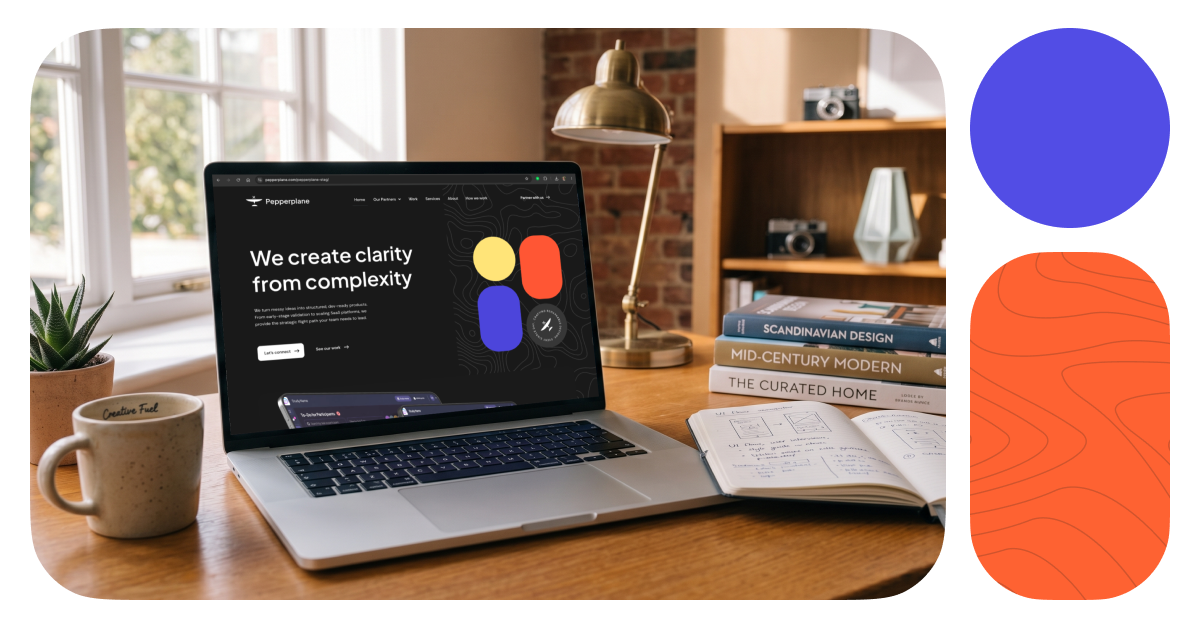
Redesigning our own website gave us a chance to experience the same questions, trade-offs, and decisions we help clients work through every day. From positioning and content to design, development, and user experience, here is what we learned when Pepperplane became its own UX project.
There is something slightly ironic about being a UX agency with a website you are no longer completely happy with. We spend a lot of our time helping clients improve websites, products, and digital experiences. We ask difficult questions, challenge assumptions, simplify complex journeys, and help teams make clearer decisions. Eventually, we realised it was time to apply that same thinking to Pepperplane.
Our business had evolved, the way we work had evolved, and the kinds of clients and projects we support had evolved. But our website had not fully evolved with us. So, for a while, Pepperplane became its own client.
That experience reminded us of something important: a website redesign is rarely just a design project. It sits at the intersection of business strategy, user experience, content, development, and brand. Each perspective sees something different, and the strongest result comes when those perspectives work together.
Your website should represent the business you are today
One of the first things we had to acknowledge was that there was nothing dramatically wrong with the old website. It still worked. It still looked like Pepperplane. But it no longer told the full story of the business we had become.
A website does not need to be broken before it needs attention. Businesses change constantly. Services become more focused, positioning becomes clearer, teams learn what they do best, and the way clients engage with the business changes. The website can easily get left behind.
From a founder and business perspective, the question became less about whether the site looked current and more about whether it accurately communicated where Pepperplane was going. Could someone quickly understand what we do? Did the site reflect how we partner with clients today? Were we making it easy for the right people to see where we could help?
A redesign is not always about fixing something that is broken. Sometimes it is about making sure the experience still reflects the business you have become.
Those questions gave us a much stronger starting point than simply asking how we wanted the new site to look.
Designing for yourself makes objectivity surprisingly difficult
When you are working on someone else’s business, it is often easier to identify what matters most. You have enough distance to challenge assumptions and ask basic questions without carrying years of internal context. Working on your own business is different. Every service feels important, every project has a story behind it, and every sentence comes with context that you already understand.
It becomes very easy to assume visitors will make the same connections you do. They usually will not.
This was one of the biggest lessons from the redesign. We had to keep stepping outside our own internal perspective and asking one simple question: What does someone visiting Pepperplane for the first time actually need to know?
That question influenced everything from the information architecture to the way we described our services. It is also a useful question for any team reviewing its own website. Familiarity can make unnecessary complexity feel normal. Sometimes the hardest part of UX is recognising what has become obvious to you but is still unclear to everyone else.
Clear messaging is part of user experience
There is a tendency to separate content from UX, but users do not experience them separately. They experience the page as one thing.
From a marketing and content perspective, one of the biggest challenges was making sure the website clearly explained Pepperplane without trying to explain absolutely everything. We looked closely at the language we were using, the order in which information appeared, and whether someone could understand our value without already knowing the UX industry.
That meant asking whether we were using language our clients actually use, whether the page answered the questions a potential client was likely to have, whether we were leading with what mattered to them rather than what mattered internally to us, and whether our calls to action were clear enough.
The goal was not to strip away personality. It was to remove unnecessary effort.
If someone has to work hard to understand what your company does, the user experience has already started to break down.
Clear messaging also supports SEO. Search engines need to understand what a page is about, but more importantly, people do too. Using natural language around UX design, user experience, UX strategy, digital product design, website UX, and UX partnerships helps the website communicate clearly without turning the content into a list of keywords.
Every page needs a purpose
One of the easiest ways for a website to become unnecessarily complicated is to keep adding information without being clear about what each page is meant to do. During the redesign, we kept coming back to one question: What is the job of this page?
A homepage needs to help visitors quickly understand the business and decide where to go next. A services page should explain how you can help. A case study needs to build confidence by showing how you think and what changed as a result of the work.
Once the purpose is clear, decisions about content, layout, and calls to action become easier. This also helps avoid a common website problem: trying to make every page do everything. Sometimes good UX comes from adding useful information. Just as often, it comes from knowing what to remove.
The designer’s job is not to make everything prettier
Naturally, visual design mattered. Pepperplane is a UX agency, after all. But from the designer’s perspective, the goal was not simply to create a more attractive website. The design had to support the story.
That meant thinking carefully about hierarchy, spacing, layout, interaction, accessibility, and how different pieces of information worked together. A beautiful section that interrupts the journey is still a UX problem. A clever interaction that makes something harder to understand is not improving the experience.
There were also decisions that looked very small from the outside but required more thought internally. The wording of a button, the placement of a call to action, the order of a section, or how content behaved on mobile could all influence how easily someone moved through the site.
Visual design works best when it makes the underlying thinking easier to understand. If the strategy is unclear, design can make that confusion look polished, but it cannot solve it.
Development is part of the UX process
A design can look perfect in Figma and still need to change when it meets the realities of development. That is not necessarily a compromise. Often, it is where the work gets better.
From the developer’s perspective, the redesign brought another important layer into the process. How should an interaction behave at different screen sizes? What happens when content changes? Is a particular pattern worth the complexity it introduces? Can something be built more simply without losing the intent behind the design?
These are UX questions too. Developer feedback can expose assumptions that are difficult to see in static screens. Sometimes it leads to a simpler implementation. Sometimes it reveals a missing state or edge case. Sometimes a technical constraint forces the team to reconsider the original interaction and arrive at a better solution.
Good UX is not designers handing developers finished screens and disappearing. The experience gets stronger when both perspectives shape the solution.
That collaboration is something we value in client work, so experiencing it internally reinforced why it matters so much.
Business, design, development, and content see different problems
One of the most useful parts of the redesign was seeing how different people looked at the same website. A founder might ask, “Does this represent where the business is going?” A designer might ask, “Is the hierarchy making the right information obvious?” A developer might ask, “How does this behave when the screen size or content changes?” Marketing might ask, “Will the right audience understand why this matters to them?”
None of those perspectives is enough on its own. They overlap, challenge one another, and occasionally create uncomfortable conversations. That is usually a good thing.
The goal is not for everyone to agree immediately. The goal is to make sure the final decision is stronger because more than one perspective was considered. That is one of the biggest lessons we would carry into any website redesign or UX strategy project: bring the right people into the conversation early enough to influence the work.
Small decisions create the overall experience
Visitors will probably never know how long some of the smallest decisions took, and that is normal. The experience of a website is built through dozens of choices that rarely become headline features: navigation labels, button copy, section order, page length, responsive behaviour, content hierarchy, and the amount of information someone sees before they are asked to take action.
Individually, these decisions feel minor. Together, they determine whether a website feels effortless or frustrating.
Good UX is often invisible in that way. People may never consciously notice that a page is easy to scan, that they always know where to go next, or that the language answers their questions before they have to search for an explanation. They simply experience less friction, and that is usually the point.
A website launch is not the finish line
Launching the new Pepperplane website does not mean we believe the experience is now permanently complete. No website should be treated that way.
User needs change. Businesses evolve. New questions appear. Search behaviour changes. Content gets added. New services emerge. What works today may need another look later.
The launch gives us a new starting point. We can watch how people move through the site, listen to the questions clients ask, review which pages people engage with, and keep improving the experience as Pepperplane continues to evolve.
A website should be treated as a living digital product, not a one-off design deliverable. That mindset is particularly important for teams investing in website UX. The goal should not simply be to launch something new. It should be to create an experience that can continue learning and improving.
What becoming our own client reminded us
Redesigning Pepperplane gave us a useful opportunity to experience the same tensions our clients often face. We wanted to say too much. We had opinions about things we were close to. We had to make trade-offs. Design decisions affected development. Content affected structure. Business priorities shaped what needed to stand out.
Throughout the process, we kept returning to the same questions we ask in client work: Who is this for? What do they need to understand? What could be clearer? What is creating unnecessary friction? Are we solving for the user, or simply designing around our own assumptions?
Those questions changed more than the way the website looks. They helped us build something that better reflects who Pepperplane is today and how we want people to experience working with us.
The new Pepperplane website is now live, and we would love for you to explore it. If your own website, product, or digital experience has evolved faster than its UX, it may be worth asking some of the same questions.
Explore the new Pepperplane website, or get in touch if you would like to talk about improving your own user experience.
Ready to Build Better Products Together?
Looking for a UX partner who can bring clarity to your next project? We’d love to chat.
Book a discovery call and let’s build something remarkable together.