Wealthbit
Helping individuals understand, plan and grow their wealth
We partnered with Wealthbit, a fintech company on a mission to empower people to build long-term financial wellness. Wealthbit makes financial planning deeply transparent and human. They needed a mobile app that could help people manage everyday money — not just long-term investments. The app connects to users’ bank accounts and displays live transactions. This data helps users set budgets and goals, and track savings and debt. Users can also apply for savings products, all from one central, accessible place.
Project Scope:
User Research
UX Assessment
UX Design
UI Design
Product Design
Branding
The Challenge
Taking control of daily financial decisions can be difficult and overwhelming. Without an easily accessible, on the go solution for budgeting, goal-setting, and real-time spending insights, individuals struggle to bridge the gap between long-term financial planning and the everyday money choices that lead to long term financial security.
For a company committed to making financial well-being accessible to all, solving this challenge was essential. Wealthbit wanted to give users the tools they need exactly when and where they need them—in the palm of their hand, in the moment decisions are made.
Our Process
Discovery
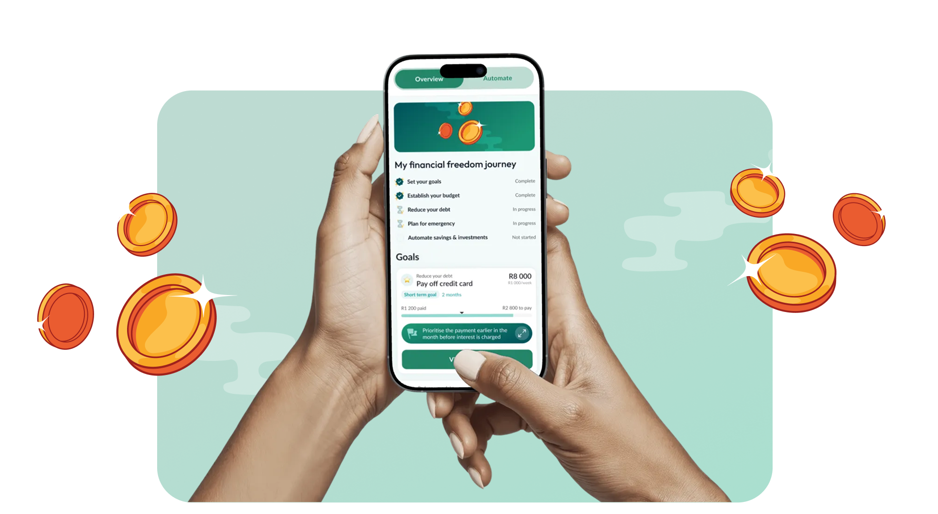
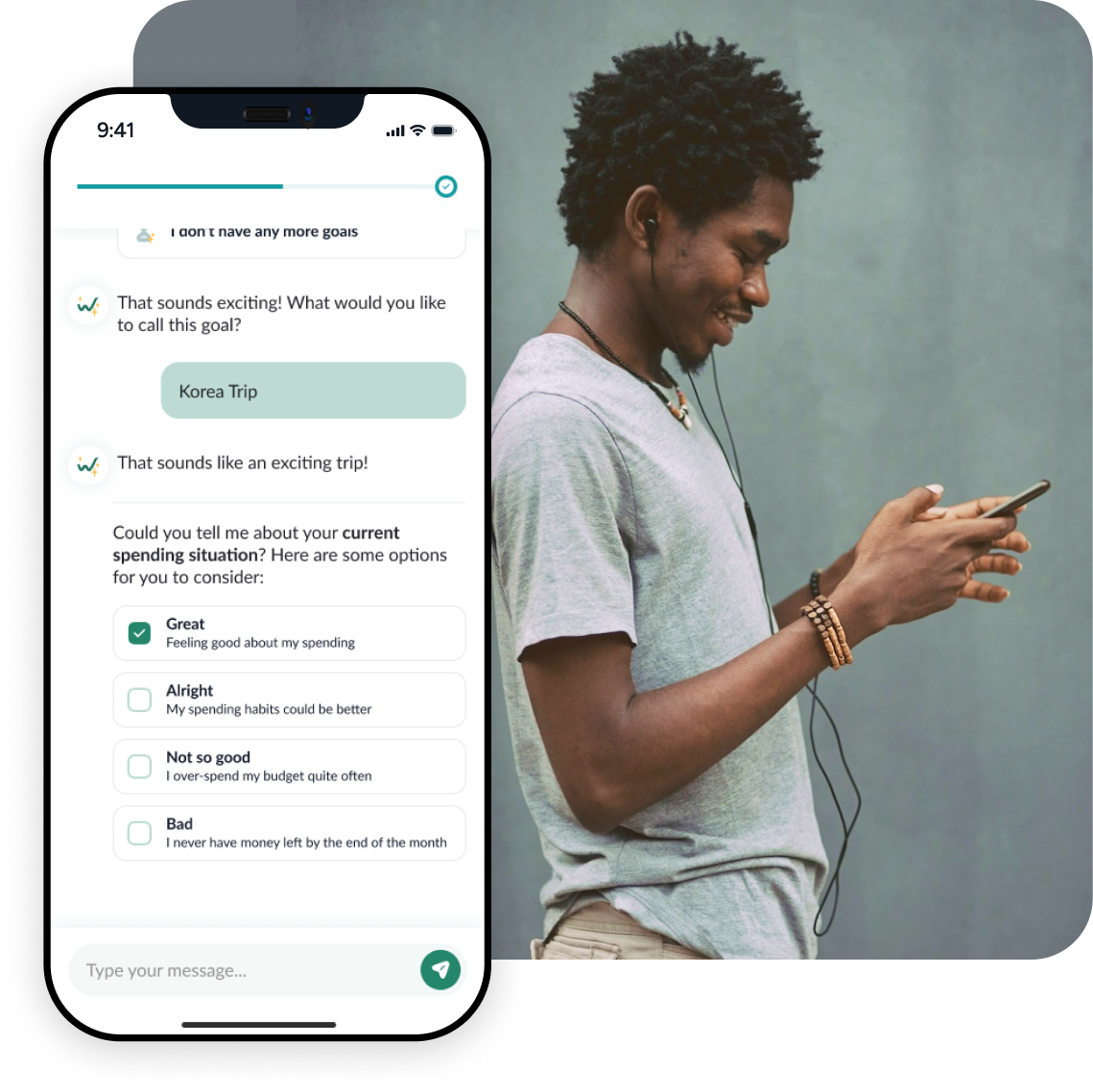
Through collaborative discovery sessions, we helped Wealthbit prioritise features for their initial launch. While the team had an ambitious vision and many valuable ideas, we needed to balance innovation with practical constraints around feasibility and timeline. Together, we identified the core experience: the Financial Freedom Journey—a personalized financial plan co-created with Tally, Wealthbit’s AI assistant. This plan would guide users through five essential pillars: budgeting, goals, emergency savings, debt management, and long-term savings.
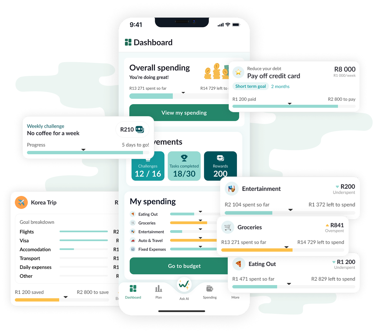
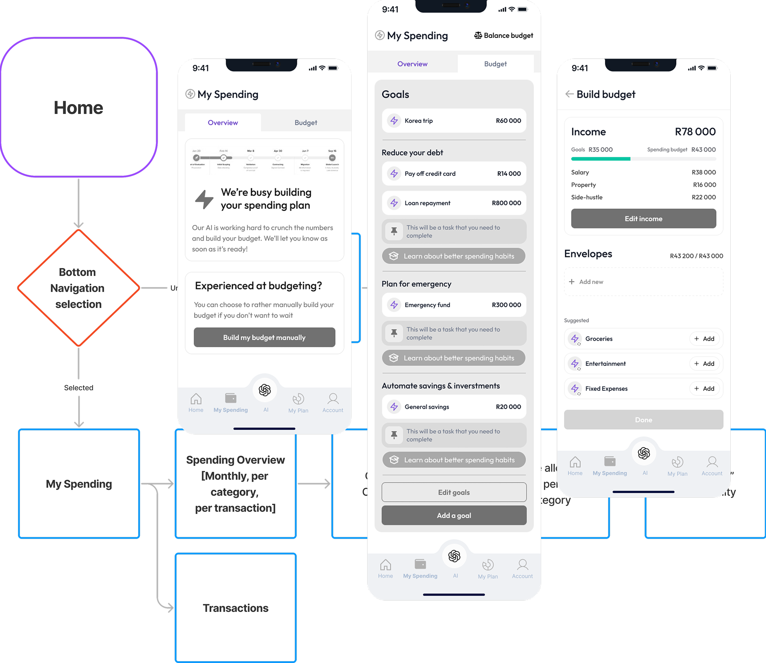
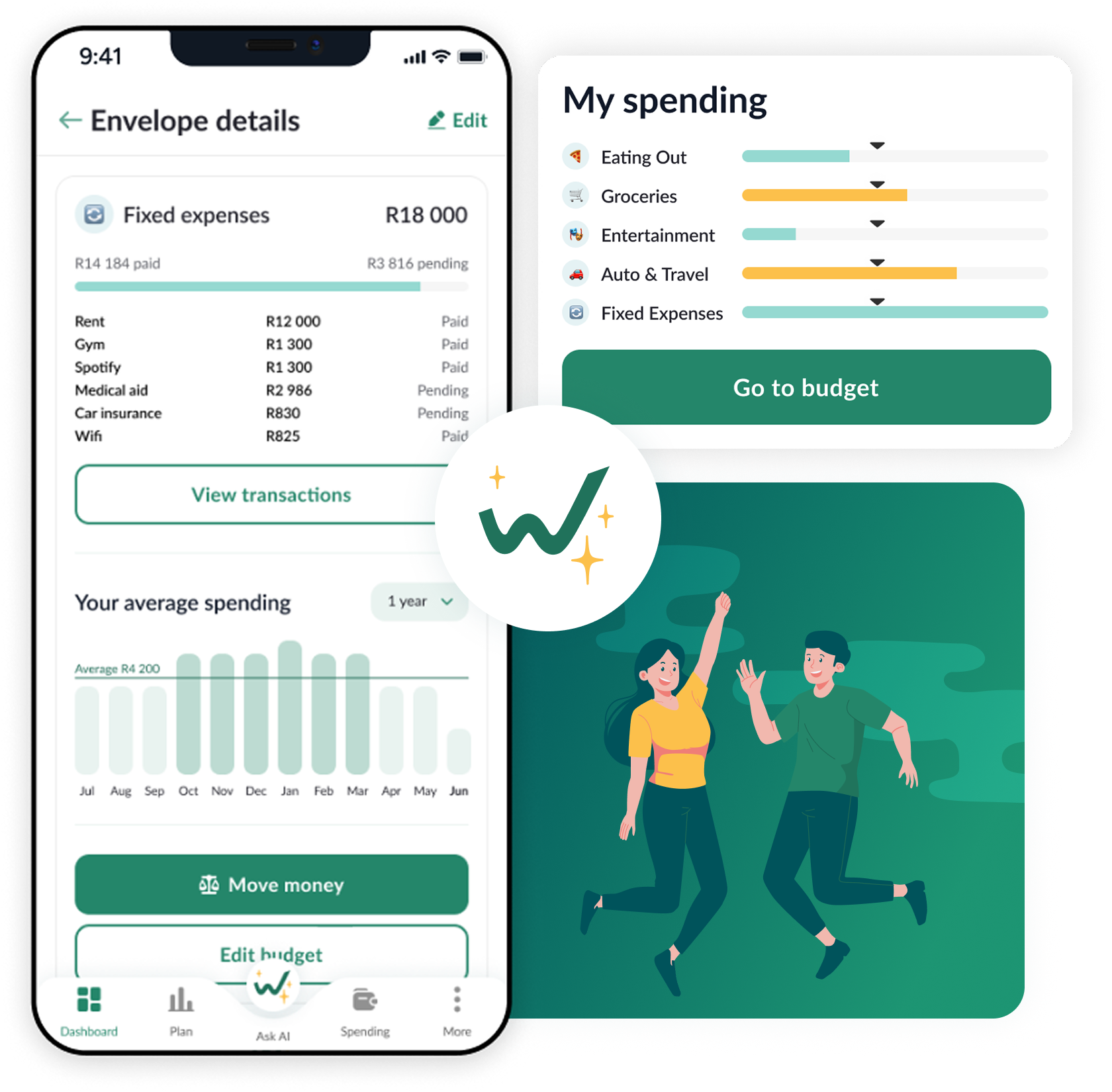
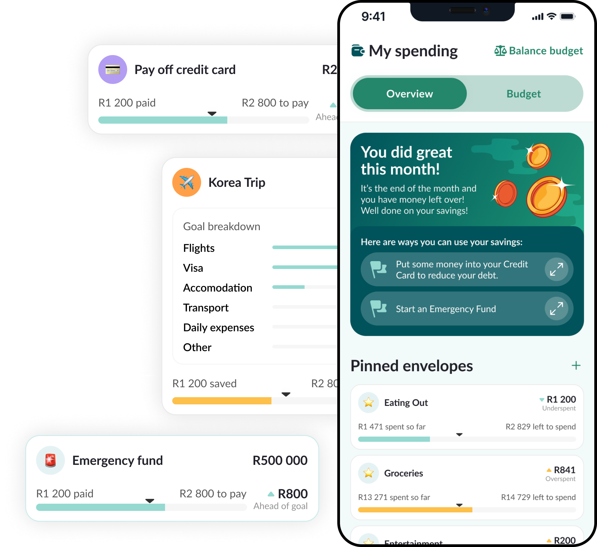
Budgeting emerged as the primary focus area, and needed sophisticated yet easy workflows for detailed budget creation and management. A key insight shaped our approach: Wealthbit understood that rigid budgets often fail because life is unpredictable. Rather than setting users up for frustration, we designed a dynamic “rebalance budget” feature that lets users to adjust their spending allocations in real-time. This compassionate understanding of how people actually manage money acknowledges imperfection while providing the tools to stay on track.
UX design
We began by mapping the complete user lifecycle—from financial struggle to freedom. This framework traced the emotional and practical journey users would take: starting in a state of financial stress, moving through education and awareness, actively implementing their plan, and achieving financial stability. At each stage, we identified frustrations, needs, and motivations, and ensured our design addressed the real challenges people face when trying to improve their financial health.
With this foundation, we developed detailed user story maps, information architecture, and user journeys to structure the entire app experience. Wireframes brought these plans to life, allowing us conceptualise layouts, interactions, and detailed workflows. Through collaborative review and iteration with the Wealthbit team, we refined these wireframes until we had a solid, validated foundation—ready for high-fidelity design.
UI design
Managing money involves countless small decisions where clarity and accuracy matter. We designed the interface to handle complex financial workflows—from detailed budget tracking to multi-step goal setting—while keeping everything intuitive and friendly. Clean layouts, logical navigation, and at-a-glance status updates ensure users always know where they stand without feeling overwhelmed.
Beyond functionality, we recognised that personal finance carries emotional weight. Anxiety, confusion, and discouragement often prevent people from engaging with their money in meaningful ways. To address this, the UI provides clear visual progress indicators that make achievements tangible, celebrates milestones with positive reinforcement, and offers personalised insights and actionable recommendations based on spending patterns. The result is an experience that supports users in building healthier financial habits with confidence.
Typography
The primary typeface for Wealthbit is Lato.


Colours
The app’s colour palette centres on a clean gradient of greens and teals, chosen to make budgeting feel calm, clear, and accessible. The deeper tones provide strong anchors for navigation and key actions, while the lighter shades add freshness and breathing room throughout the interface. Together, the palette creates a sense of trust and stability while keeping the experience modern and welcoming.


I've followed Pepperplane and how it's grown and developed for over a decade and it's never strayed from it's roots. Before Pepperplane existed, Marié taught me, probably far more elegantly than I can explain, that design was about far more than what a product looked like, but rather how it worked. When Wealthbit embarked on creating a completely new product on their mission to get 10 million South Africans into good financial health, I knew that figuring out what we should build was paramount. Naturally I turned to Pepperplane to help. On a modest budget and rapidly changing requirements, Pepperplane was able to deliver not only the entire design of our mobile app vision, but also a click-through interactive prototype, and the foundations of a solid design system that grew into what the product is built on today.
In a time where you can build apps faster than ever, it's even more important to lean on those whose expertise it is to figure out _what_ should actually be built, and _how_. Pepperplane took us through a refined process to do just that: informal interviews throughout the project that extracted our decades of financial coaching expertise, taking us through UX -> UI -> prototype.
The Conclusion
Solving this challenged was core to Wealthbit’s mission: to make financial planning accessible, actionable, and emotionally supportive. By bringing budgeting, debt management, and investing into one mobile experience, they can help their users gain real-time control over their money — not just plan for the future, but live toward it.
Tools Used
Figma and ClickUp are great for UX projects because they offer seamless collaboration, efficient project management, and a comprehensive suite of design and organisational features.
Figma
UX / UI Design
clickup
Project Management & Tracking
Google Suite
Interviews & Note Capturing