EdgeUno
Bridging the LATAM Connectivity Gap.
We transformed EdgeUno’s complex product ecosystem into a high-performance digital gateway, blending technical precision with deep-rooted regional expertise.
Project Scope:
UX Design
Information Architecture
UI Design
Visual Identity
The Brief
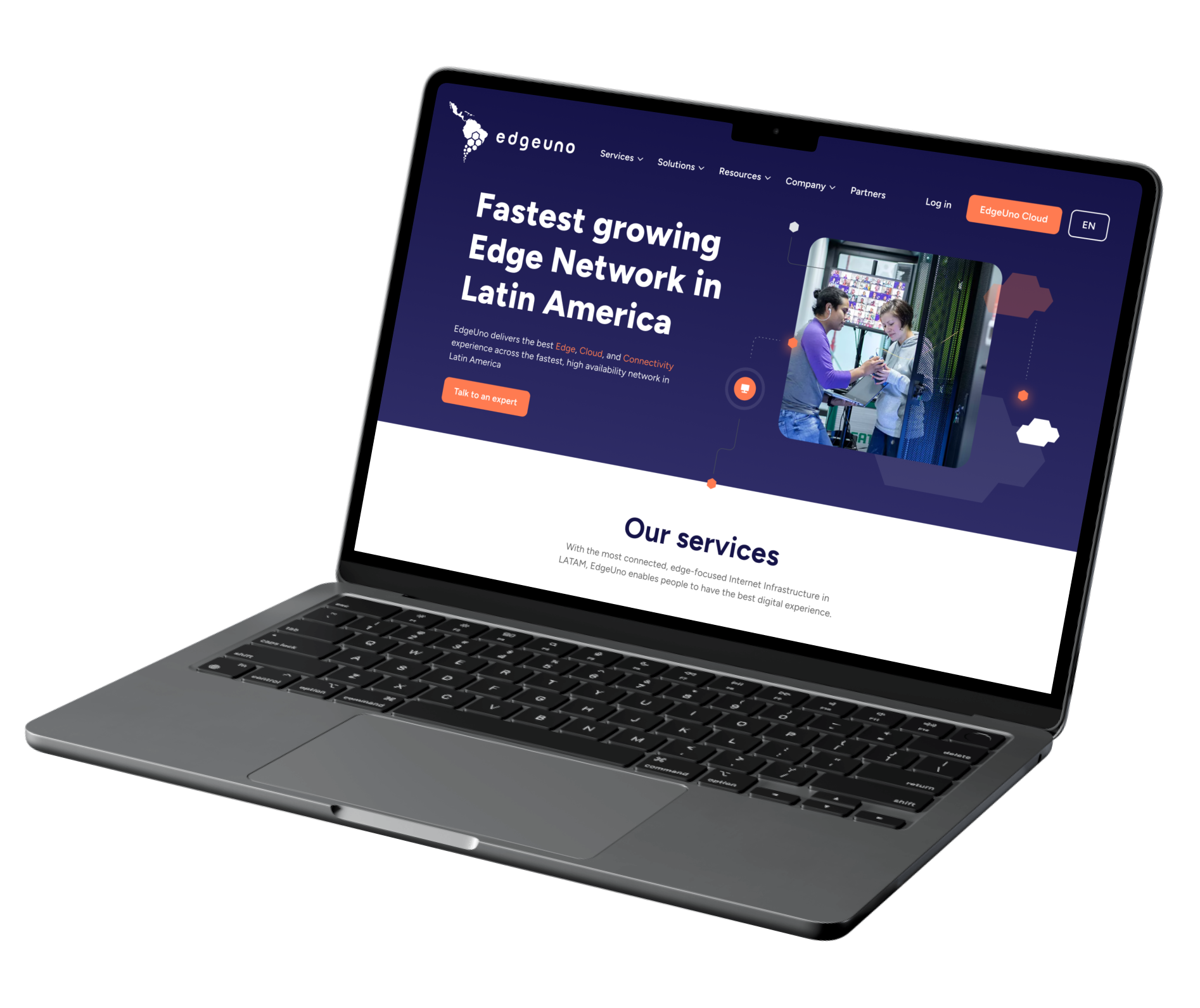
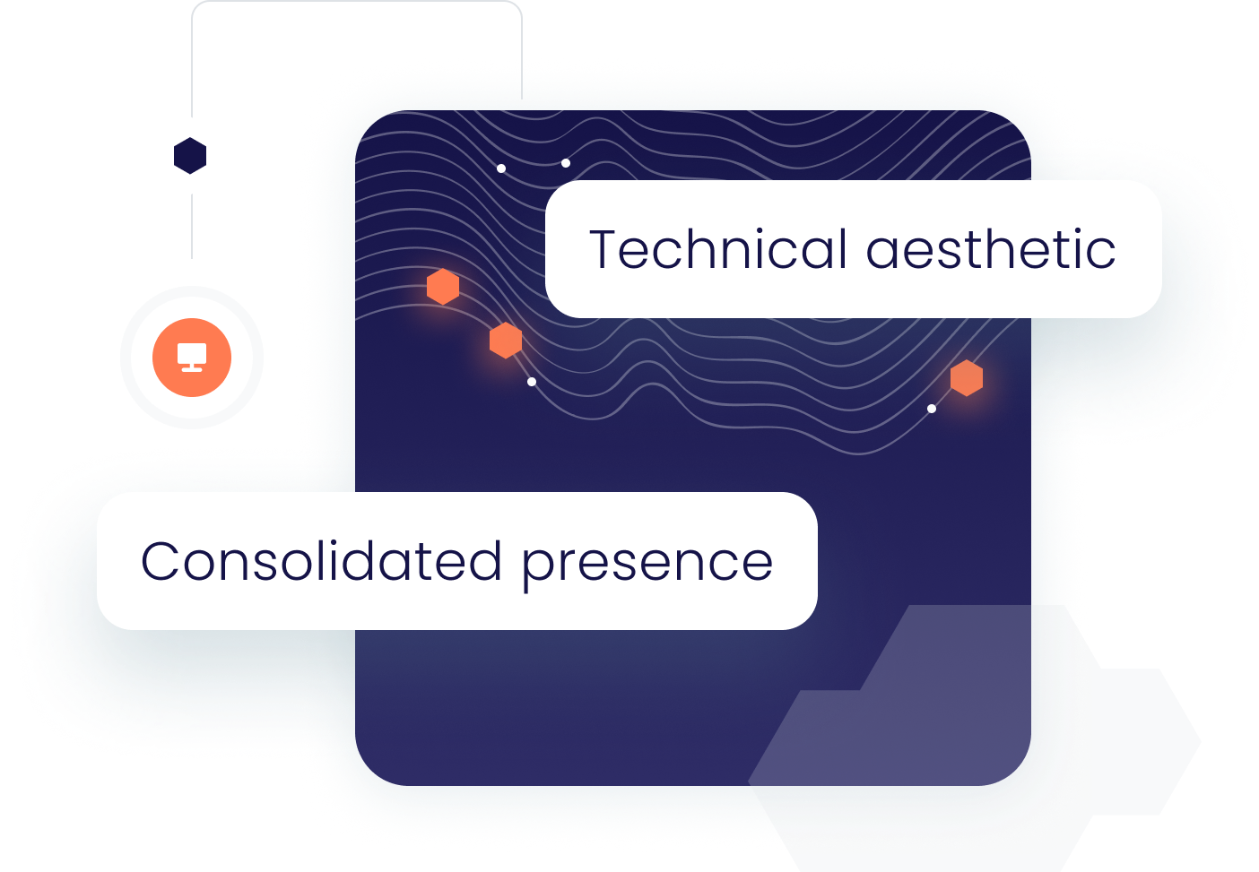
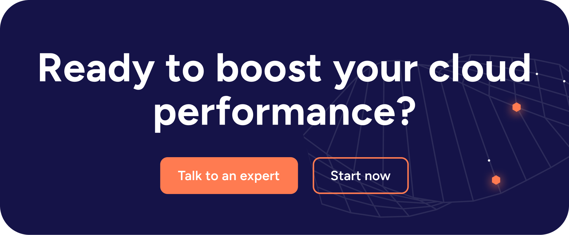
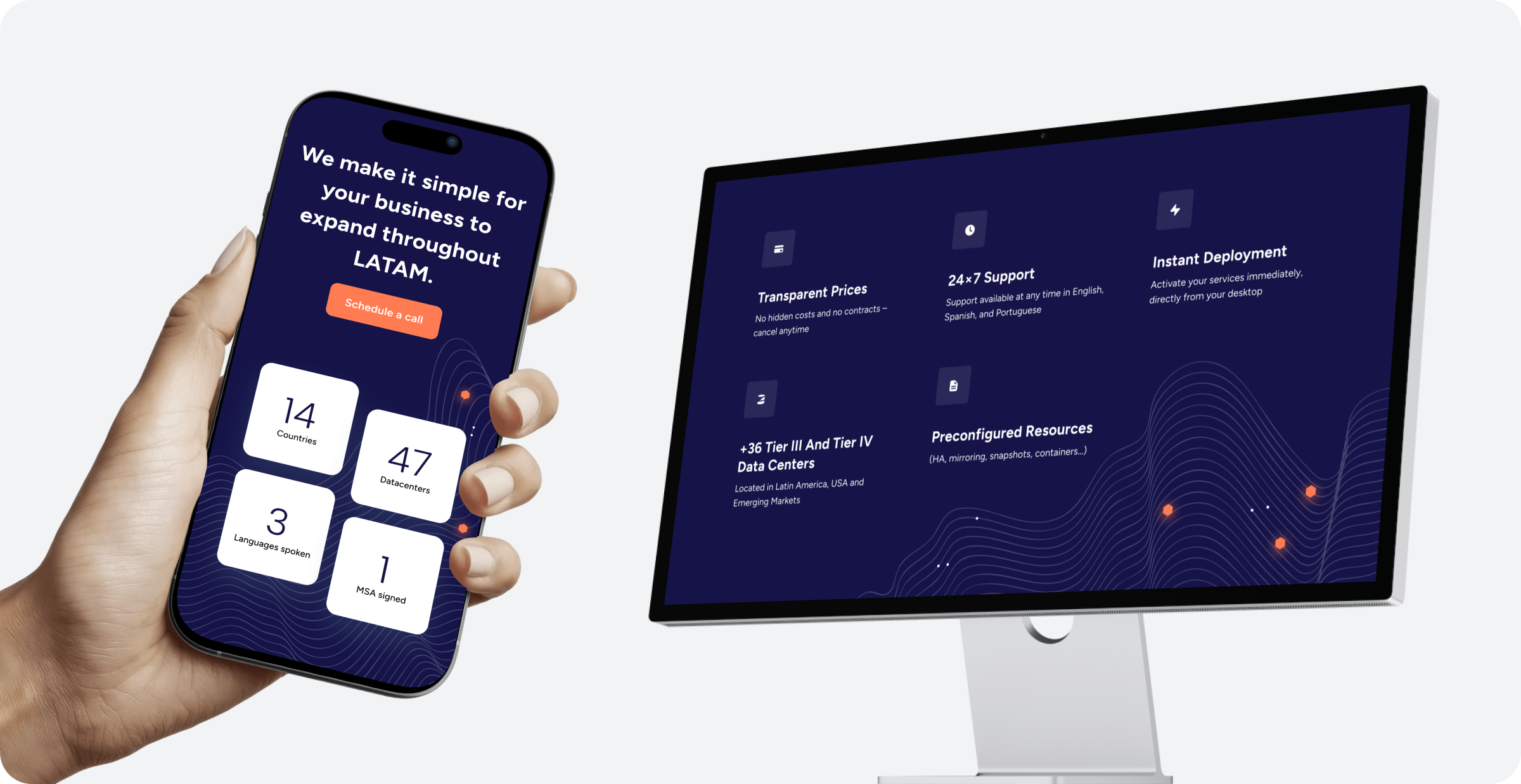
EdgeUno needed to consolidate a fragmented digital presence. The goal was to migrate their cloud offerings into a single, high-converting home that positioned them as the definitive experts in LATAM expansion. They required a technical aesthetic that prioritized clarity, easy translation, and an aggressive CTA strategy.
The Work
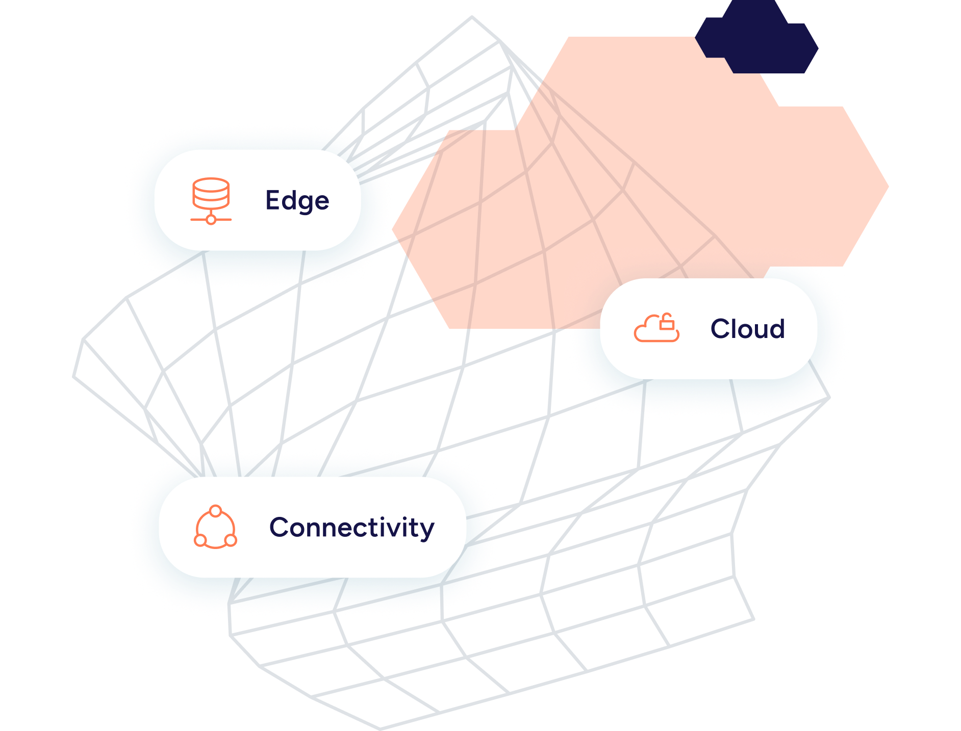
Architecting Complex Product Hierarchies
The primary challenge was structure. We audited a sprawling list of services and distilled them into three core pillars: Edge, Cloud, and Connectivity. By restructuring the Information Architecture, we transformed a dense ecosystem of products into a seamless, intuitive navigation experience.
A Human-Centric Technical Interface
Drawing inspiration from technical, text-heavy platforms, we leaned into a “Dark Mode” aesthetic. This allowed us to highlight critical data and “Talk to an Expert” touchpoints without visual fatigue. The layout was engineered to be lightweight—facilitating rapid translation and global performance.
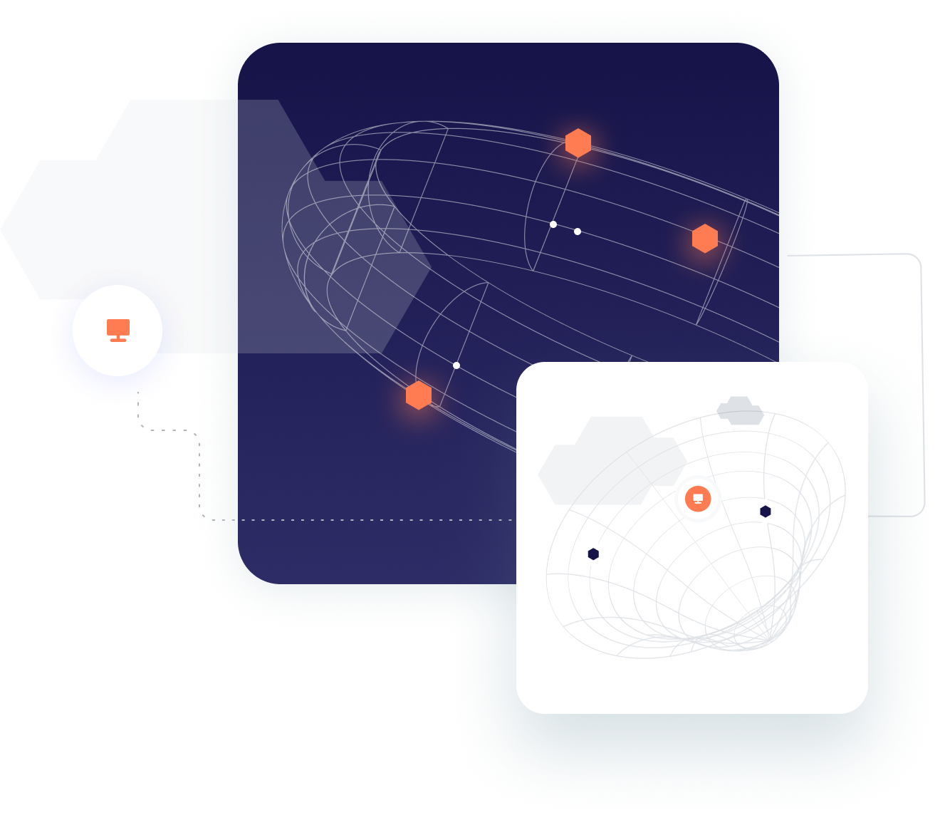
Visual Language & Geometry
The visual system is an extension of the EdgeUno DNA. We utilized hexagonal motifs and dot-matrix patterns inspired by the client’s logo—a fusion of the South American continent and modular connectivity. These geometric shapes represent the 3,000+ directly connected networks, turning abstract data into a tangible visual narrative.
Typography
We selected Figtree. Its clean, geometric sans-serif properties provide the modern legibility required for a text-heavy site, ensuring the “Expand to LATAM” messaging remains the hero.


Colour Palette
We anchored the brand in a deep, authoritative Navy (#151348) and introduced a vibrant Orange (#FF7B51) as the primary action color. This contrast ensures that CTAs are impossible to miss while maintaining a sophisticated, trustworthy “tech” feel.
Primary colours


Neutrals


The Conclusion
We delivered a digital platform that successfully bridges the gap between high-level infrastructure and local expertise. By balancing a technical “Bare Metal” aesthetic with warm, country-specific representation.
We positioned EdgeUno not just as a service provider, but as the essential partner for any global company entering the LATAM market.
Tools Used
Figma and ClickUp are great for UX projects because they offer seamless collaboration, efficient project management, and a comprehensive suite of design and organisational features.
Figma
UX / UI Design
clickup
Project Management & Tracking
Google Suite
Interviews & Note Capturing