Firenze
Establishing brand identity and digital presence during a critical startup growth phase.
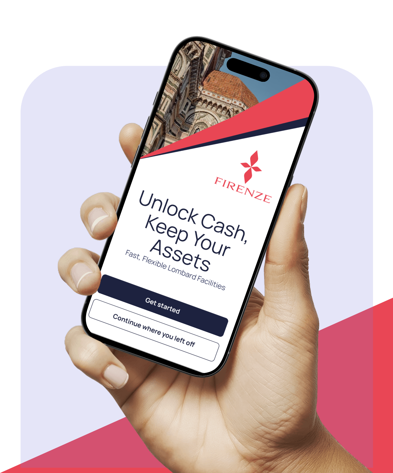
Firenze is a Manchester-based fintech innovator that helps wealth managers, advisers, and investment platforms offer Lombard lending—investment-backed loans—to their clients. Pepperplane designed their mobile application and helped to develop their online presence.
Project Scope:
Mobile app design
UX Design
UI Design
Website design
The Brief
When Firenze approached us, they were facing a critical challenge: Their loan application process was largely manual and paper-based.
For a fintech aiming to scale rapidly and partner with wealth managers across the UK, this created friction at every stage—slow approvals, inconsistent experiences, and limited ability to white-label their service for different partners. If they were going to truly democratise Lombard lending and reach their ambitious goal of enabling over £1 billion in loans, they needed a digital solution that was fast, elegant, and flexible enough to work seamlessly across multiple partner brands.
Our Process
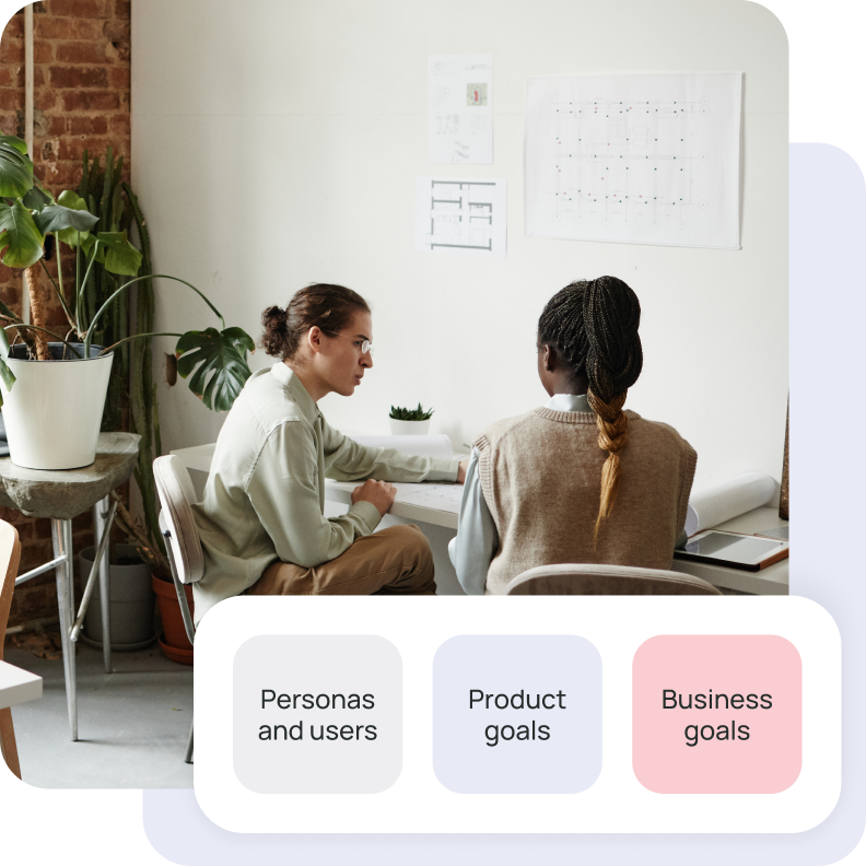
Discovery
We began by exploring business and product goals, and understanding key value propositions of Firenze’s offering. Firenze aimed to replace a third-party app being used, and had a number of requirements relating to partnerships and white labelling. We also discussed their offering in relation to their primary user groups – wealth managers and clients – and how the new solution would benefit them.
UX strategy and wireframes
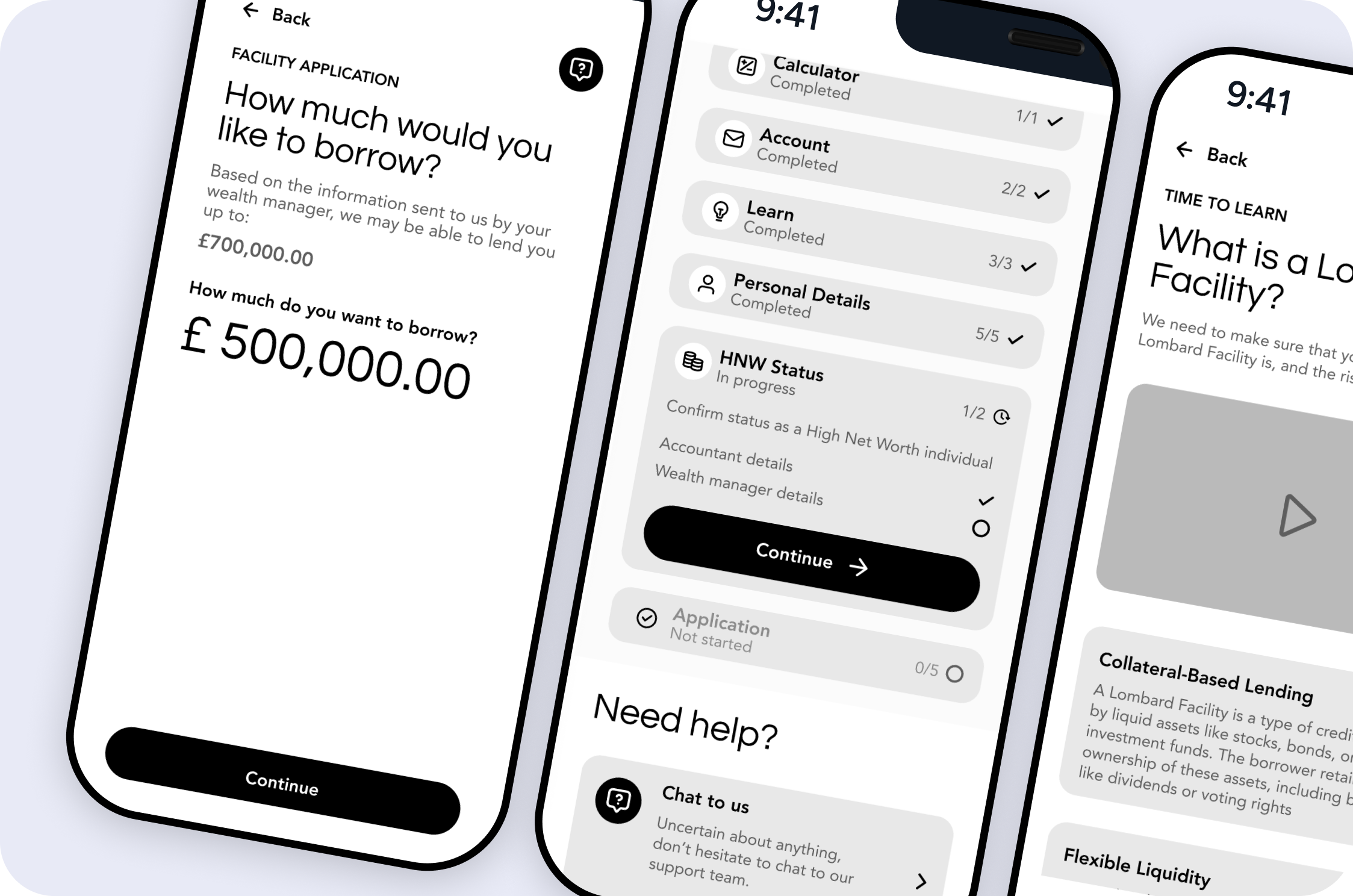
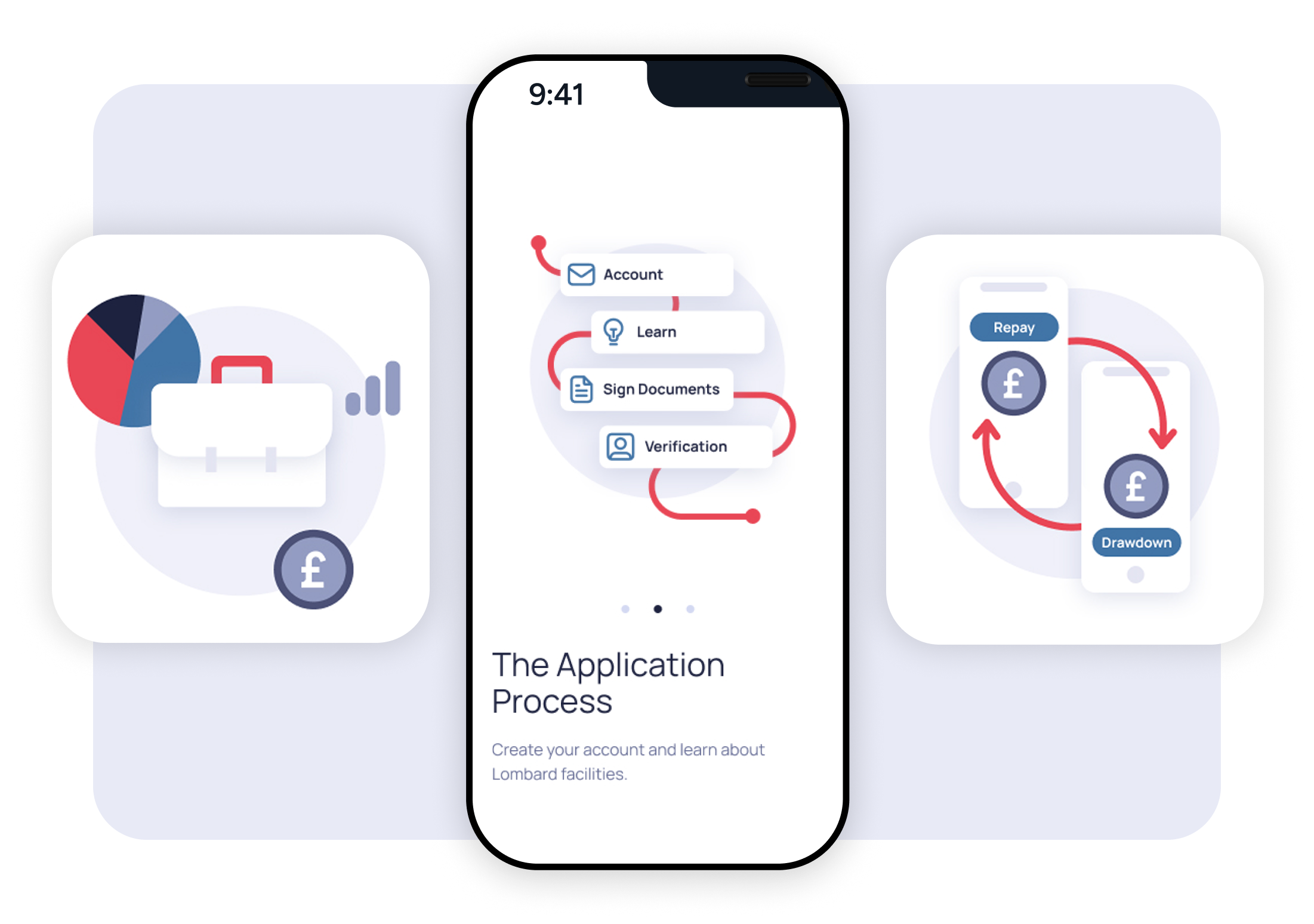
Guided by what we learned during the discovery phase, and what was needed for an MVP product, we starting exploring user flows and interface concepts.
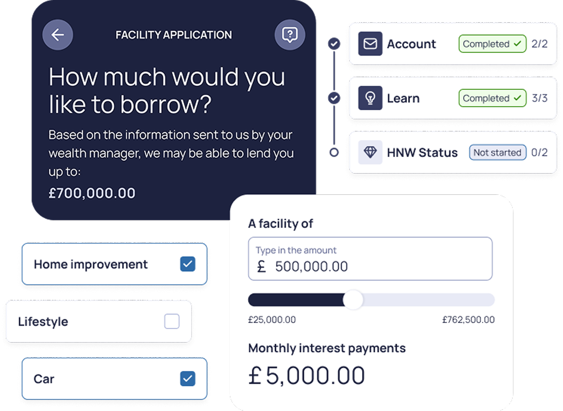
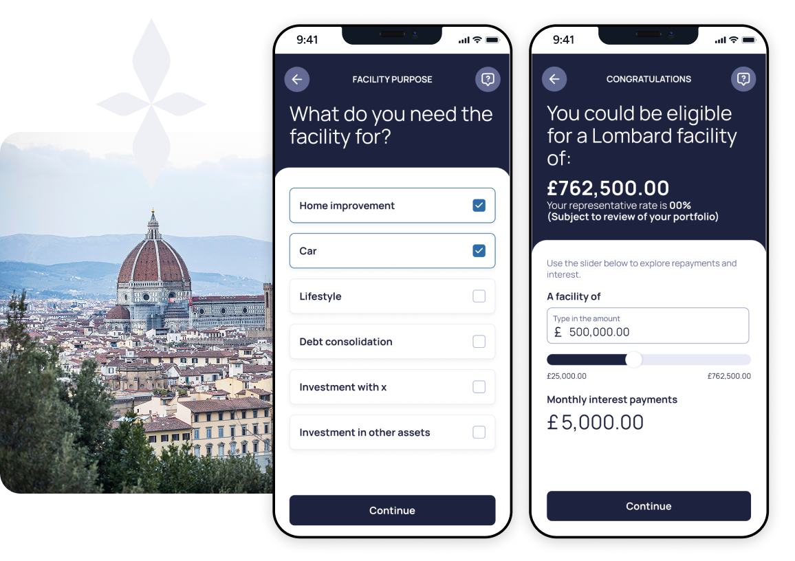
UI design
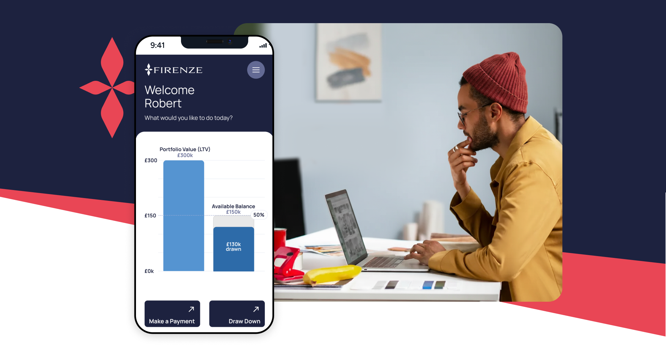
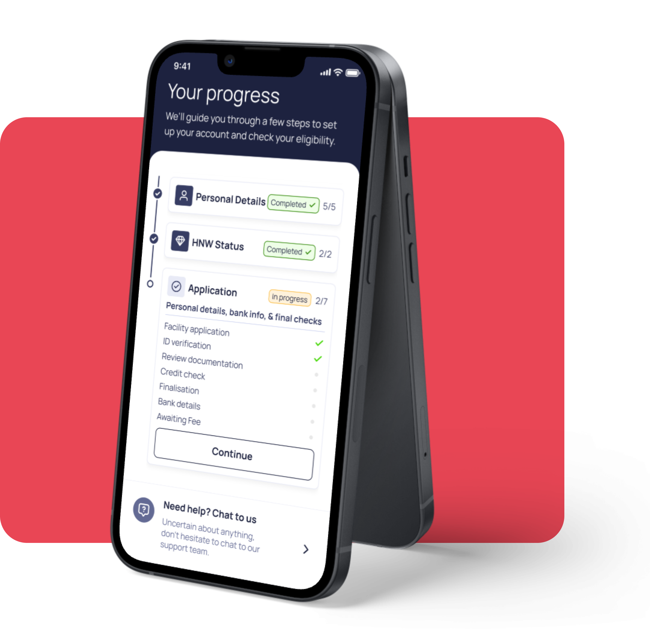
We created UI designs for tablet and mobile phones. The design focuses on clear communication to clients, and a simple, clean layout that can easily be white labelled by partners.
Onboarding illustrations
We created custom illustrations to accompany the onboarding flow.
Typography
The primary typeface for Brandname is Poppins.


Colour Palette
Firenze’s colour palette balances energy with sophistication. The vibrant orange brings warmth, approachability and contrast, while the dark navy anchors everything with reliability and trust—essential for a financial brand. It’s a fresh fintech palette that maintains a nod to the rich history that the company was founded on.


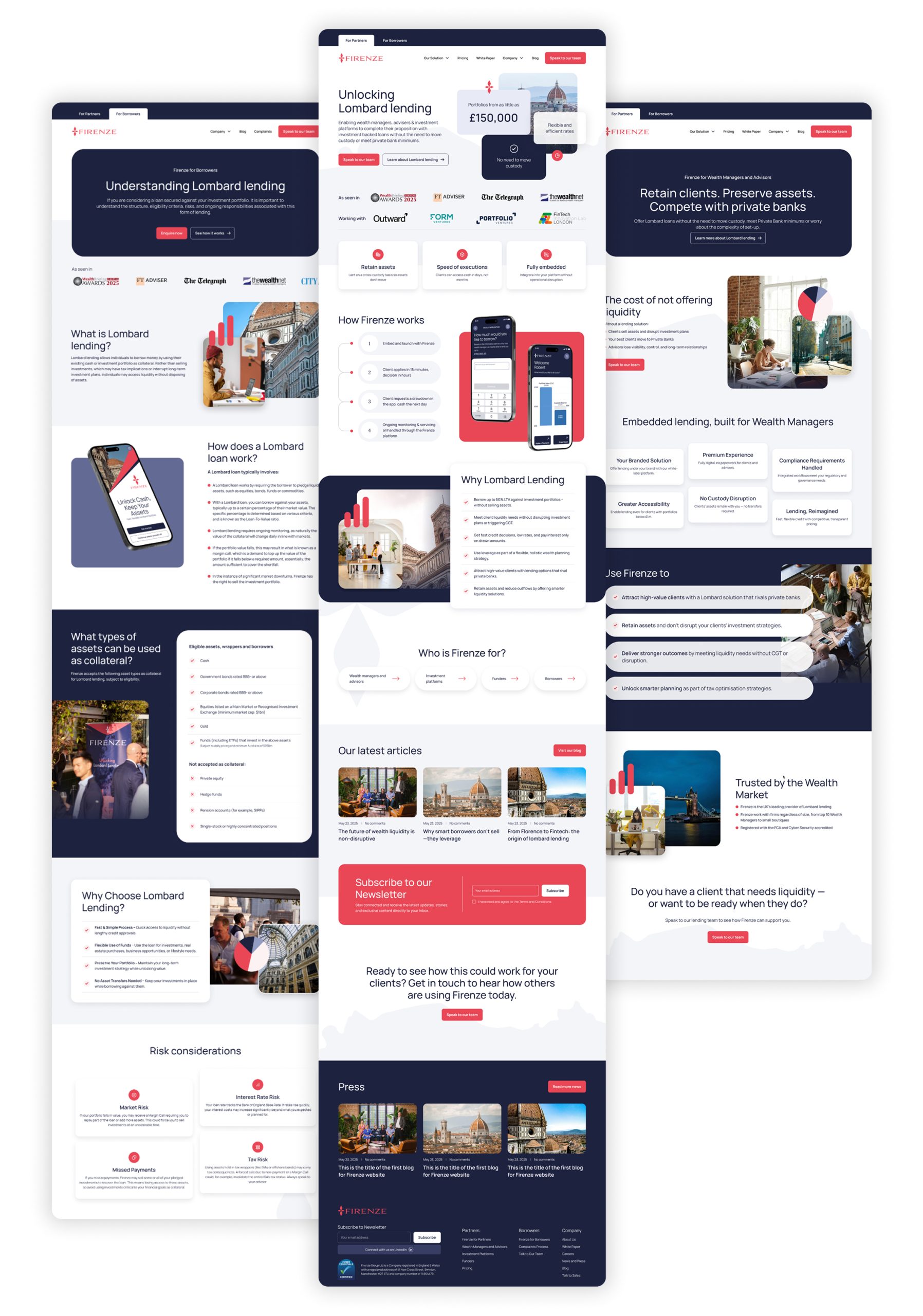
Website design
The website design works with the original Firenze colours palette, but introduces new graphic elements to create a sophisticated brand evolution.
The Conclusion
Firenze’s new app transformed what was once a manual, time-consuming loan application into a streamlined, digital experience easily accessible from any mobile device.
We helped further elevate Firenze’s brand presence in the fintech space with a sophisticated new website that balanced their existing red and navy palette with a refined, elegant aesthetic that communicates trust, innovation, and accessibility.
Together, these digital touchpoints gave Firenze the tools to scale their mission and deliver a premium experience that stands out in a competitive market.
Tools Used
Figma and ClickUp are great for UX projects because they offer seamless collaboration, efficient project management, and a comprehensive suite of design and organisational features.
Figma
UX / UI Design
clickup
Project Management & Tracking