HMP leads the US market in digital health interventions, helping research teams turn grant-funded studies into custom apps powered by an admin portal, giving remote access to global participants. But onboarding new interventions was slow and manual; months of meetings, documentation, and back-and-forth made the process rigid, delayed launches, and prevented scale. The goal was to digitise the workflow, cut repetition, reduce lead time, and enable HMP to run more research projects in parallel.
HMP leads the US market in digital health interventions, helping research teams turn grant-funded studies into custom apps powered by an admin portal, giving remote access to global participants. But onboarding new interventions was slow and manual; months of meetings, documentation, and back-and-forth made the process rigid, delayed launches, and prevented scale. The goal was to digitise the workflow, cut repetition, reduce lead time, and enable HMP to run more research projects in parallel.
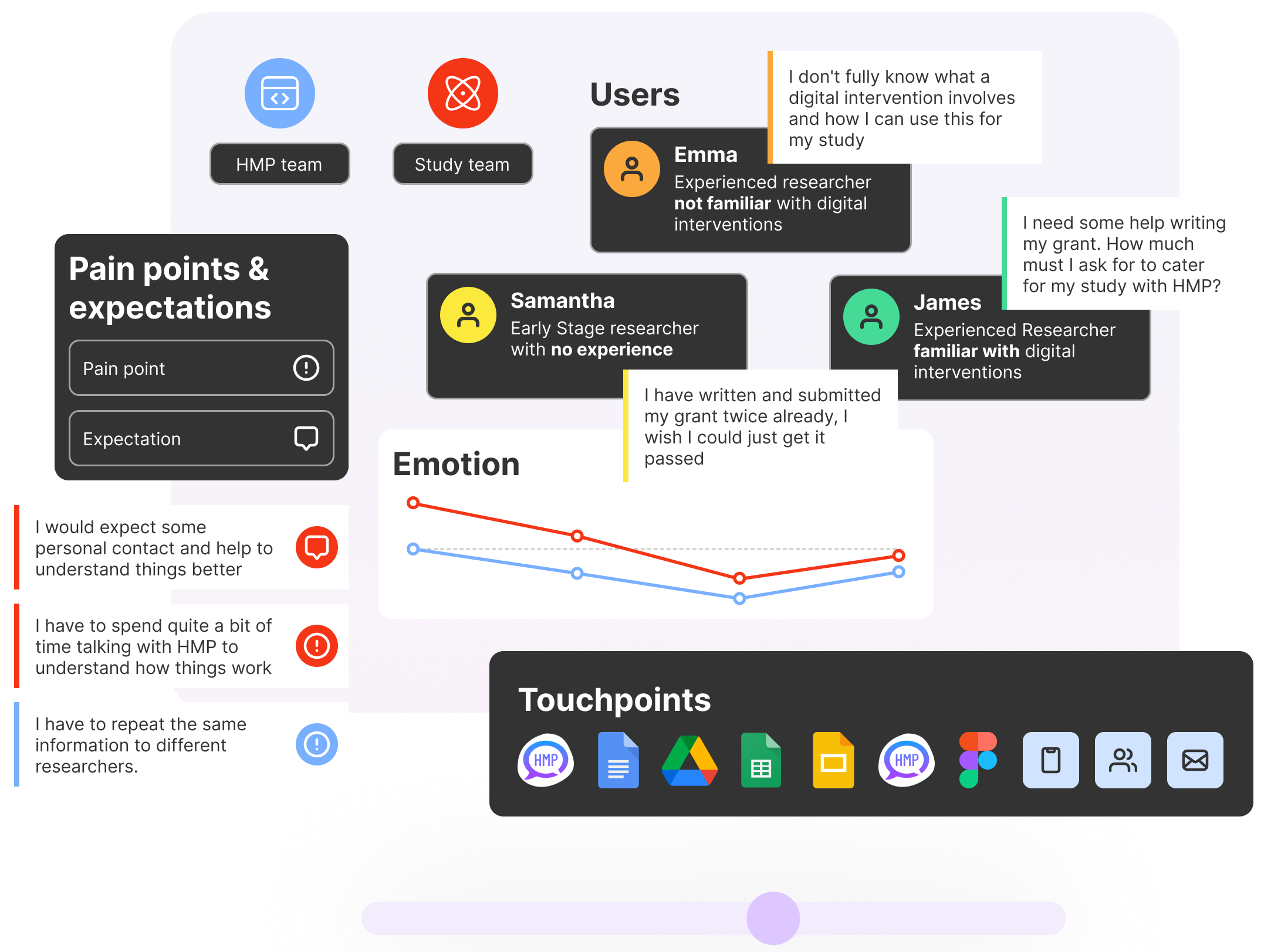
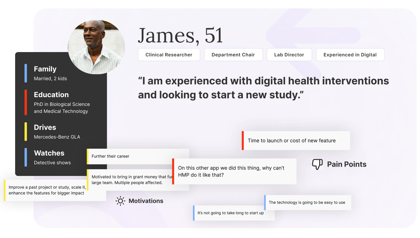
We kicked off with multiple discovery workshops with stakeholders, mapping the workflows and emotional journey across both the Research and HMP teams. We overlaid pain points and expectations at each step, as well as the touch points and tools being utilised. After our personas were complete, we then pushed further into insight, mapping what each persona is thinking, doing, saying, and feeling at each step. That clarity exposed key experience gaps and helped align everyone around a clear vision for the product.
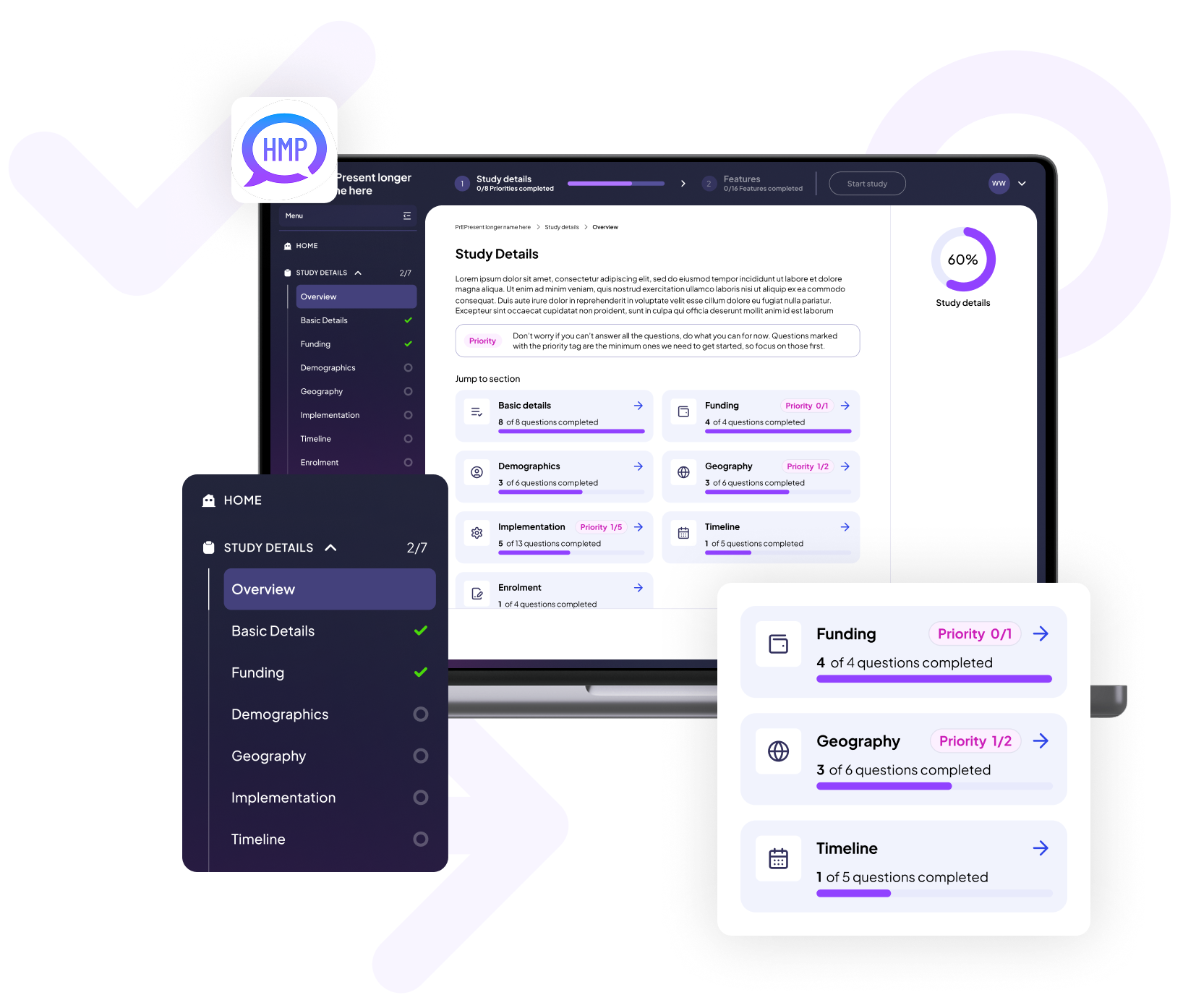
Working from a robust set of personas, we built out problem statements that clearly articulated users’ needs. After prioritising these problems with stakeholders, we ran multiple ideation sessions to build a vision of the optimal product experience. These solutions were moved into UX planning, which included user flows, information architecture and content planning, before being fleshed out into medium-fidelity wireframes.
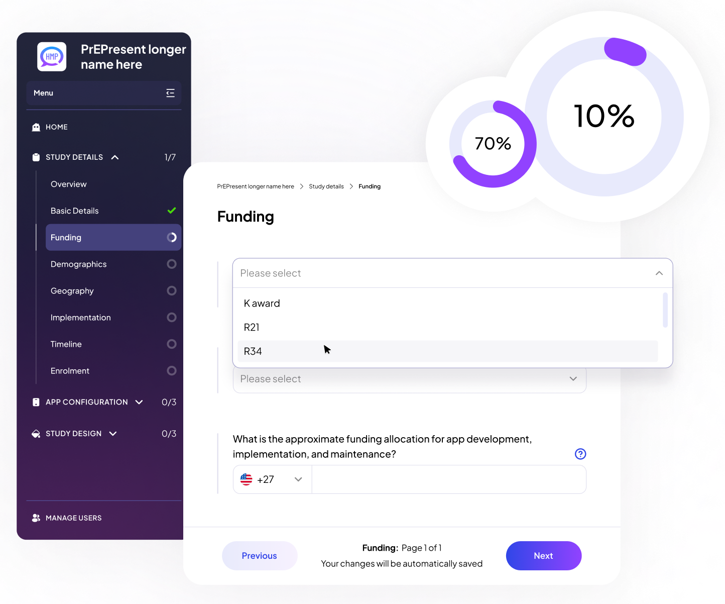
Our team embedded directly into their Agile delivery rhythm, aligning with sprint planning and grooming processes. As the UX partner, we helped prioritize design work and supported the development team with just-in-time assets and feedback, ensuring consistent and user-centered execution throughout the 12-month timeline.
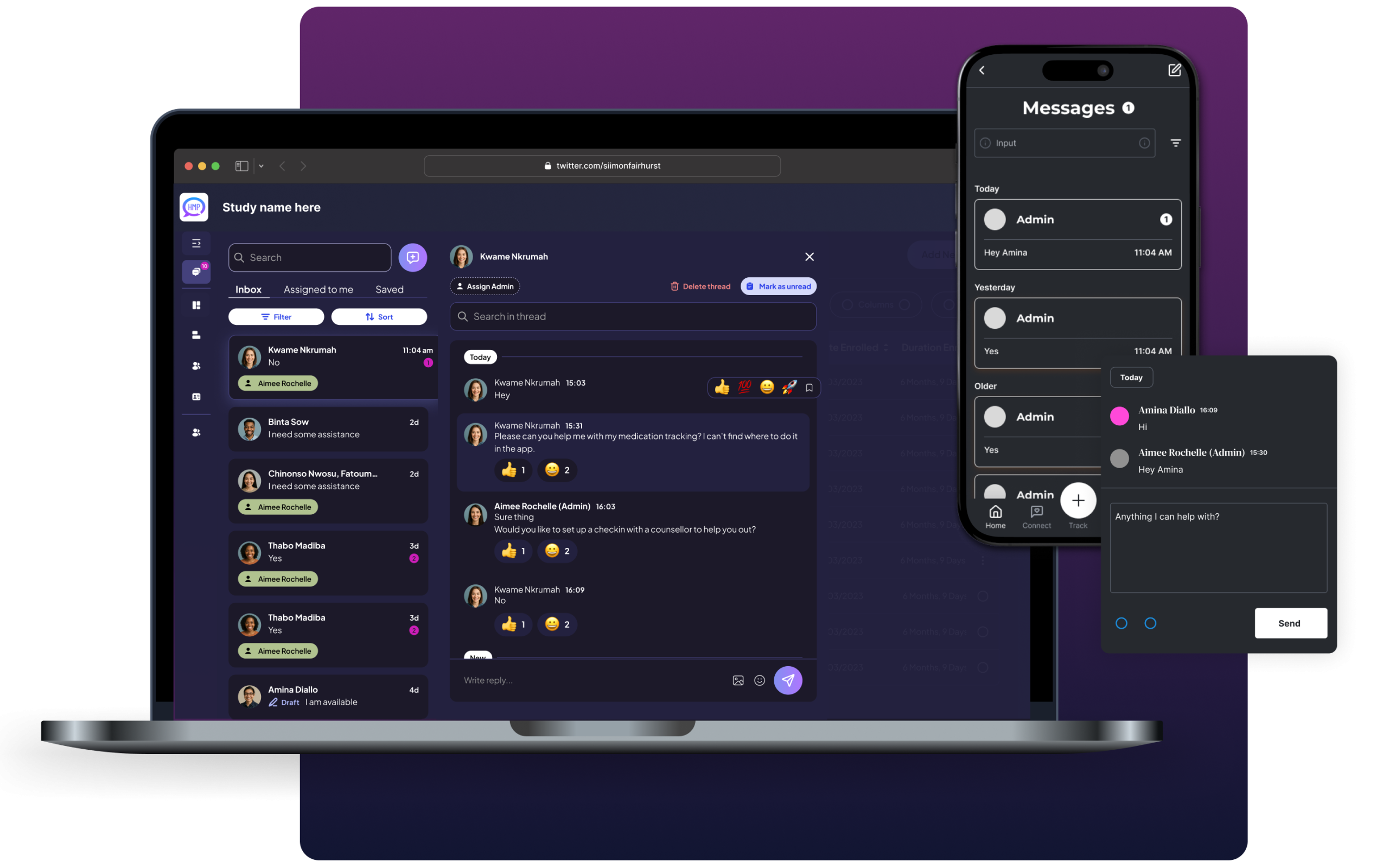
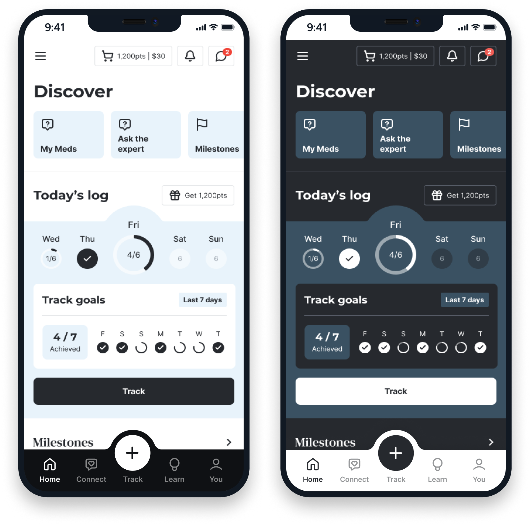
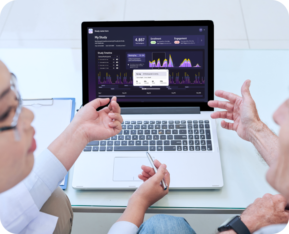
We developed a robust design system to serve as a single source of truth for all platform components. The system included scalable UI patterns, accessibility guidance, and built-in support for both light and dark modes—ensuring consistency, flexibility, and efficiency across the admin tools and mobile app experiences.
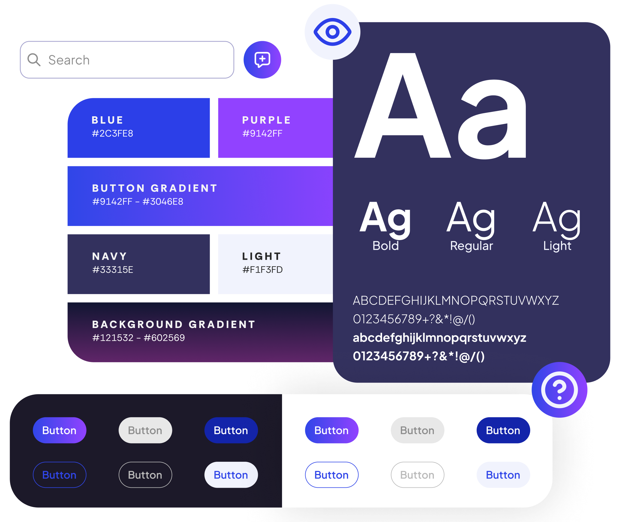
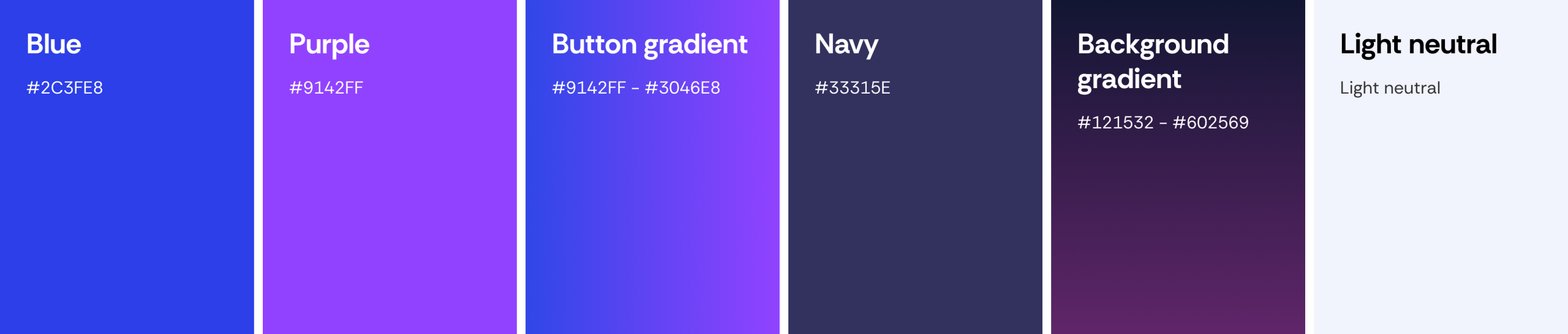
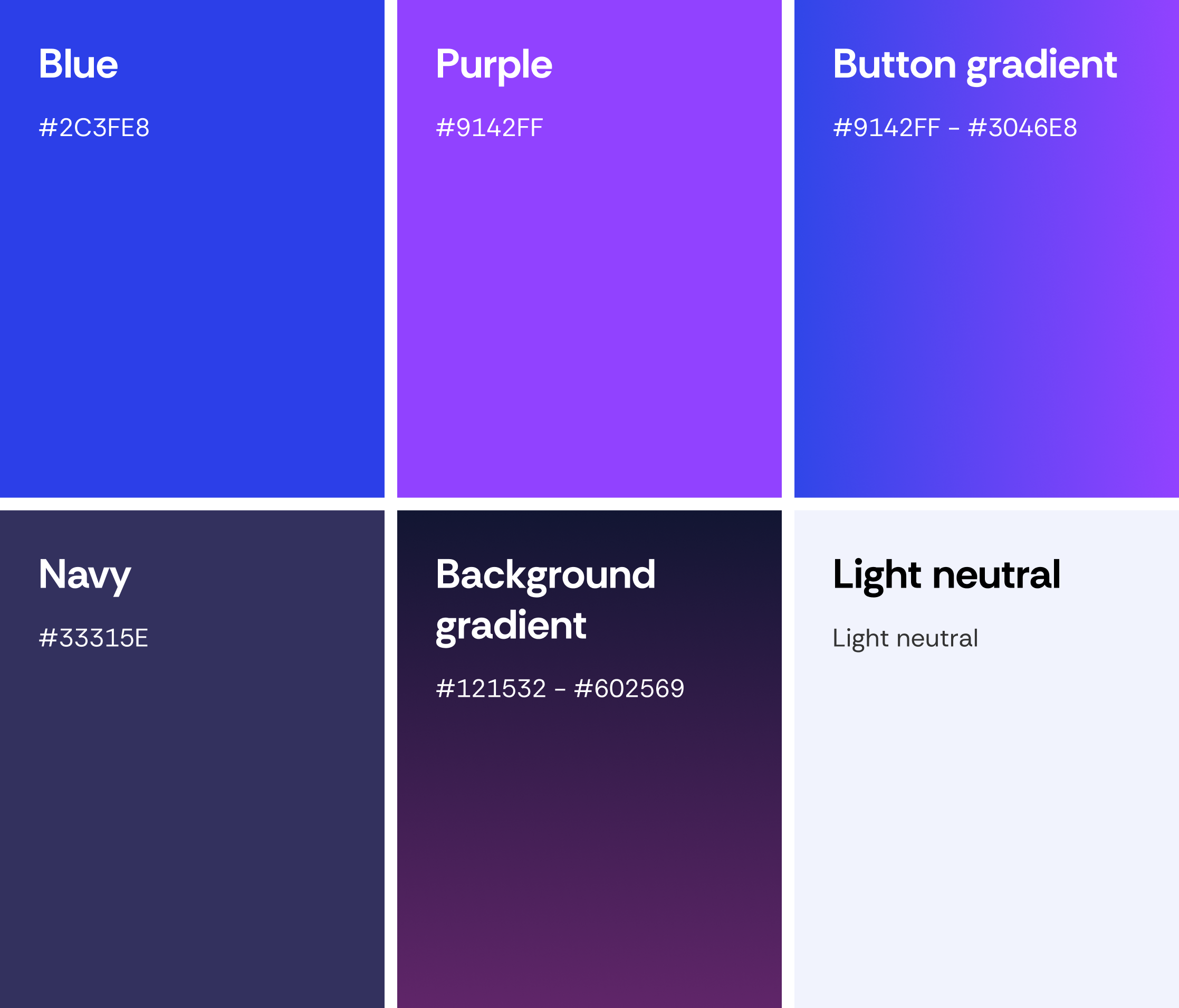
This vibrant palette blends electric blue and rich purple to convey innovation, trust, and engagement. Deep navy and twilight gradients add depth and focus, while the soft neutral ensures clarity. It reflects a modern, approachable, and friendly experience.
Plus Jakarta Sans is a modern sans-serif typeface with clean lines and balanced proportions. Its geometric simplicity exudes professionalism and readability across various design contexts.


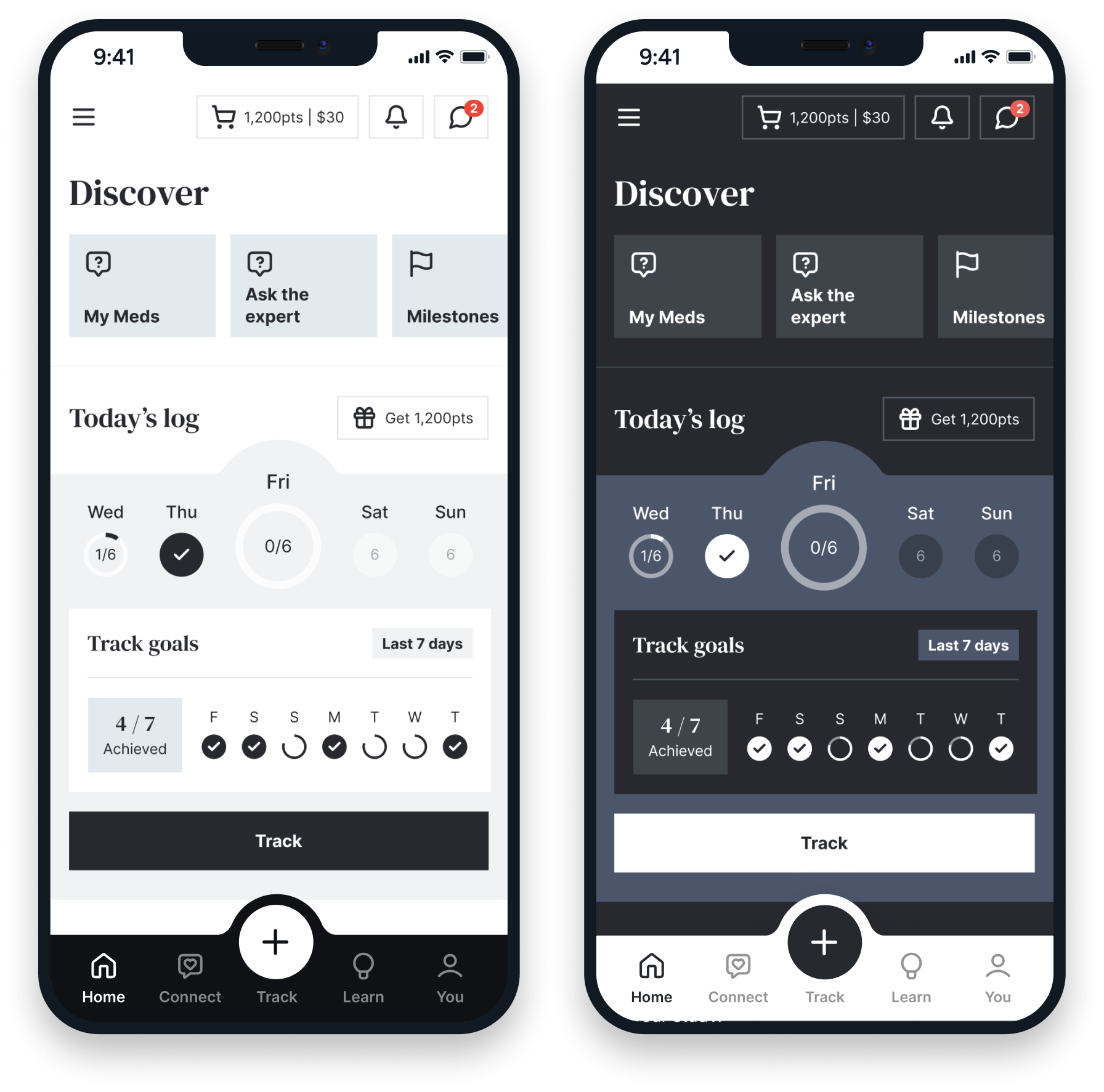
Clean, confident, and reliable. This theme uses neutral colours, precise layouts, and structured typography to communicate trust and competence. Designed for studies that need to feel organised, credible, and easy to navigate.

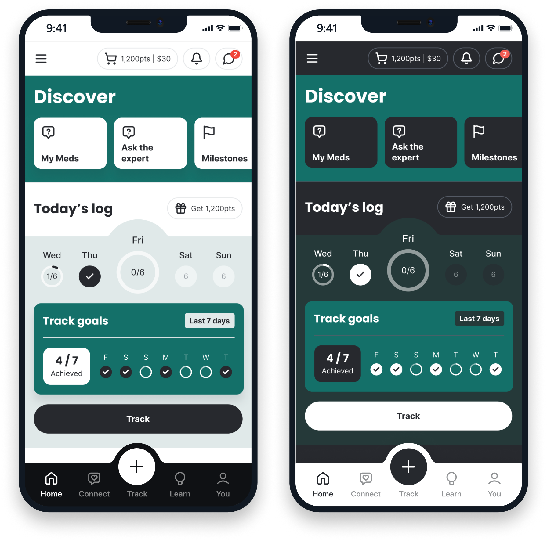
Lively, engaging, and positive. This theme uses vibrant colours, expressive icons, and a friendly feel to create an uplifting atmosphere. Perfect for studies that aim to motivate participants, encourage interaction, or make the experience feel friendly and approachable.


Warm, cheerful, and welcoming. This theme feels soft and human — with bright colours, friendly shapes, and lighthearted visuals. It’s ideal for studies focusing on wellbeing, lifestyle, or patient engagement, helping participants feel at ease and cared for.

Calm, focused, and refined. This theme embraces simplicity — with clean lines, subtle colour contrasts, and generous white space that lets the content take centre stage. It’s designed to create a sense of clarity and ease, helping participants concentrate on what matters most without distraction. Although it was ultimately cut from the final delivery, we’ve included it here to showcase the full range of design exploration.

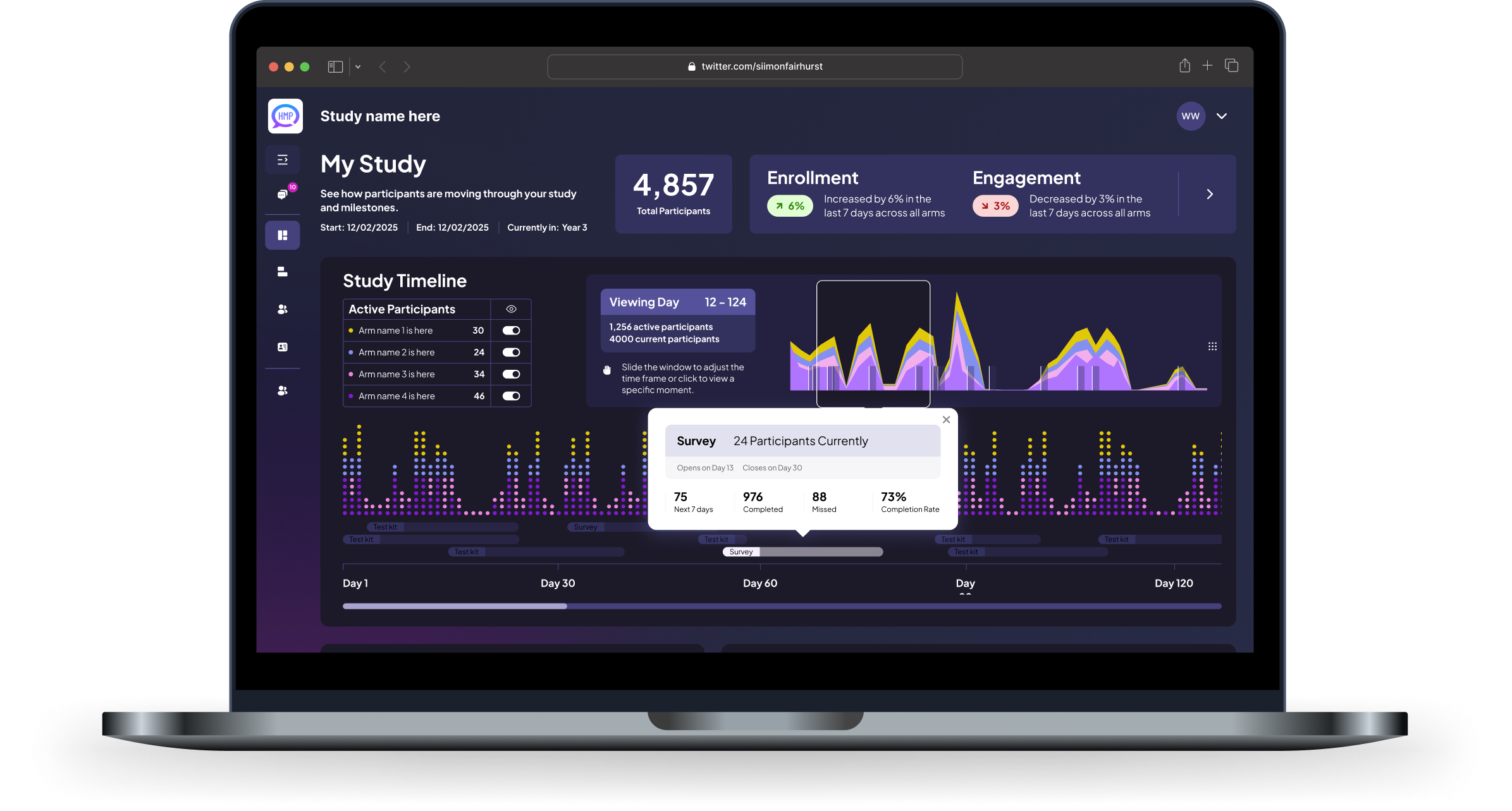
The new platform architecture clarified the participant experience, streamlined administrator workflows, and provided researchers with better tools to gather, analyze, and respond to data.
Design refinements improved user retention, lowered onboarding friction, and gave the organization the flexibility they needed to expand their research model.
Figma and ClickUp are great for UX projects because they offer seamless collaboration, efficient project management, and a comprehensive suite of design and organisational features.
UX / UI Design
Project Management & Tracking

A design process that creates measurable, predictable and more profitable results.